Please comment with your links.
You’ve worked hard this semester, (hopefully) learned a lot, and have a good foundation for your future classes. Thanks so much for all your effort.
Happy holidays and please reach out to me anytime!
Professor Hicks
Please comment with your links.
You’ve worked hard this semester, (hopefully) learned a lot, and have a good foundation for your future classes. Thanks so much for all your effort.
Happy holidays and please reach out to me anytime!
Professor Hicks
HTML
The term “box model” is often used by people when talking about CSS-based layouts and design. Any HTML element can be considered a box, and so the box model applies to all HTML elements.
The box model is the specification that defines how a box and its attributes relate to each other. In its simplest form, the box model tells browsers that a box defined as having width 100 pixels and height 50 pixels should be drawn 100 pixels wide and 50 pixels tall.
There is more you can add to a box, though, like padding, margins, borders, etc. This image should help explain what I’m about to run through:

Let’s go to this website to check out the full tutorial on box models.

DO NOW | BOX MODEL
DO NOW | CODE ACADEMY
NO. 11 – CSS POSITIONING
The Box Model – lessons 1 – 5
MARGINS AND PADDING
Margins refer to the area around, or outside of an element. Padding, refers to the area between the edges of a box and what lives inside that box.
An easy way to remember which is which is to think of mailing a breakable object – you fill the empty space in the box with foam peanuts to protect the item. Those foam peanuts are your padding. The margin would then be the space between your box and the next box in the truck. Just remember: Padding is inside the box, margins are outside the box.
In CSS, you’ll use padding to give an element some breathing room within the space it’s in, as we did with the last example in the Backgrounds section. You typically use margins to cause a box or element to be offset from adjacent elements. The syntax for working with padding and margins is very similar.
Padding and margins may just seem decorative right now, but they’ll become critical when we start getting into CSS page layout, so make sure you understand them.
Example:
p {
padding:25px;
border:4px solid blue;
}
Would give you below:
Just like borders, padding can be controlled for the whole box, as above, or per-side:
p {
padding-top:0px;
padding-right:25px;
padding-bottom:45px;
padding-left:15px;
border:4px solid blue;
}
When setting padding values separately for different sides of a box, you can use this shorthand, which achieves exactly the same result as the previous example:
p {
padding:0px 25px 45px 15px;
border:4px solid blue;
}
MARGINS
To illustrate how margins work, I’ll show you how one element (box) relates to another. For this example, we’ll be putting a sample paragraph inside of an element called a “div”. A div is an arbitrary box used to contain other things. I’ll put a border on the div so you can see it, then put a paragraph with its own border inside that div, so you can see what the margin attributes do to it.
div {
padding:0px;
margin:0px;
border:1px solid blue;
background-color:#AFEEBD;
}
p {
padding:10px;
margin:10px;
border:1px solid blue;
background-color:#ACCFDB;
}
The blue space above represents the paragraph, while the green space represents the margin between that paragraph and it’s containing box. As with padding, we can control margin depths per-side, rather than globally.
DO NOW | CODE ACADEMY
NO. 11 CSS POSITIONING
Margins, Borders, and Padding
Complete tutorials
Margins, Borders, and Padding – Lessons 6-12
Floating – Lessons 13-16
Static and Relative POSITIONING
CSS Position and Alignment Properties Values
absolute – stays where you tell it regardless of other objects
fixed – appended to window (moves when user scrolls)
relative – placed next its normal position
static – placed in its default position
Static and Relative Position
The static and relative position properties stack. Note that static is the default position value of an element, should you fail to apply any other value. If you have three statically positioned elements in your code, they will stack one on top of the next. Look at the example below with three elements, all with a position value of static:
#box_1 {
position: static;
width: 200px;
height: 200px;
background: #ee3e64;
}
#box_2 {
position: static;
width: 200px;
height: 200px;
background: #44accf;
}
#box_3 {
position: static;
width: 200px;
height: 200px;
background: #b7d84b;
}

This is what your HTML page would look like:
<!DOCTYPE>
<html>
<head>
<title>Untitled Document</title>
<link rel=”stylesheet” href=”style.css” type=”text/css” media=”screen” />
</head>
<body>
<!– page content goes here inside the body –>
<div id=”box_1″>
</div>
<div id=”box_2″>
</div>
<div id=”box_3″>
</div>
</body>
</html>
This is what you style.css page would look like:
#box_1 {
position: static;
width: 200px;
height: 200px;
background: #ee3e64;
}
#box_2 {
position: static;
width: 200px;
height: 200px;
background: #44accf;
}
#box_3 {
position: static;
width: 200px;
height: 200px;
background: #b7d84b;
}
Above is the static value for a simple, single-column layout where each element must sit on top of the next one. You cannot shift those elements around using offset properties such as top, right, bottom, and left. These properties are unavailable to a static element.
Relative Positioning
Relatively positioned elements behave just like statically positioned elements. In the example below I’ve applied the relative value to the position element:
#box_1 {
position: relative;
width: 200px;
height: 200px;
background: #ee3e64;
}
#box_2 {
position: relative;
width: 200px;
height: 200px;
background: #44accf;
}
#box_3 {
position: relative;
width: 200px;
height: 200px;
background: #b7d84b;
}
Example B proves that relatively positioned elements behave exactly the same way as statically positioned elements. BUT, elements with a relative position value have far greater powers than their static siblings.
–
When positioning relative, you can adjust a relatively positioned element with offset properties: top, right, bottom, and left. Using the markup from my previous example, let’s add an offset position to #box_2:
#box_2 {
position: relative;
left: 200px;
width: 200px;
height: 200px;
background: #44accf;
}
By just adding the property: left: 200px, you see relative positioning in action. The three blocks are still stacked up but now the blue block (#box_2) is pushed out 200 pixels from the left. See what it looks like below:

The blue block is still in the flow of the document—elements are stacking one on top of the other—but notice the green block (#box_3) on the bottom. It’s sitting underneath the blue block, even though the blue block isn’t directly above it. When you use the offset property to shift a relatively positioned element, it doesn’t affect the element(s) that follow. The green box is still positioned as if the blue box were in its non-offset position.
For the next example, we won’t change any CSS, we’ll adjust our HTML to move #box_2 inside of #box_1:
<div id=”box_1″>
<div id=”box_2″></div>
</div>
<div id=”box_3″></div>
Note what I did:
The first example, each div is opened and then it is closed:
<div id=”box_1″>
</div>
<div id=”box_2″>
</div>
<div id=”box_3″>
</div>
In this example, box_1 is opened, box_2 is opened, then you close box_1 and close box_2, and finally you open div box_3 and then you close the div.
Below is what it will look like:

Because of the new coordinate system, the blue block measures its offset 200 pixels from the left of the red block (#box_1) instead of the document. This practice is more common with elements set to position: absolute.
POSITION ABSOLUTE
Now lets take a look at the position:absolute
Unlike the static and relative values, an absolutely positioned element is removed from the normal flow. You can put it anywhere and it won’t affect or be affected by any other element in the flow. Think of it as an element with a giant strip of velcro on its back. Just tell it where to stick and it sticks. Exactly like the relative value, absolutely positioned elements respond to offset properties for positioning. You can set an element to top: 100px and left: 200px; and that element will sit exactly 100px from the top and 200px from the left of the document. Look at an example using four elements:
#box_1 {
position: absolute;
top: 0;
left: 0;
width: 200px;
height: 200px;
background: #ee3e64;
}
#box_2 {
position: absolute;
top: 0;
right: 0;
width: 200px;
height: 200px;
background: #44accf;
}
#box_3 {
position: absolute;
bottom: 0;
left: 0;
width: 200px;
height: 200px;
background: #b7d84b;
}
#box_4 {
position: absolute;
bottom: 0;
right: 0;
width: 200px;
height: 200px;
background: #ebde52;
}

<!DOCTYPE html PUBLIC “-//W3C//DTD XHTML 1.0 Transitional//EN” “http://www.w3.org/TR/xhtml1/DTD/xhtml1-transitional.dtd“>
<html xmlns=”http://www.w3.org/1999/xhtml“>
<head>
<meta http-equiv=”Content-Type” content=”text/html; charset=UTF-8″ />
<title>Untitled Document</title>
</head>
<body>
<!– page content goes here inside the body –>
<div id=”box_1″>
</div>
<div id=”box_2″>
</div>
<div id=”box_3″>
</div>
<div id=”box_4″>
</div>
</body>
</html>
The CSS is
#box_1 {
position: absolute;
top: 0;
left: 0;
width: 200px;
height: 200px;
background: #ee3e64;
}
#box_2 {
position: absolute;
top: 0;
right: 0;
width: 200px;
height: 200px;
background: #44accf;
}
#box_3 {
position: absolute;
bottom: 0;
left: 0;
width: 200px;
height: 200px;
background: #b7d84b;
}
#box_4 {
position: absolute;
bottom: 0;
right: 0;
width: 200px;
height: 200px;
background: #ebde52;
}
——–
Just like relative elements, absolute elements create a new coordinate system for child elements. Use two or all four offset properties, and you can stretch an element without defining any width or height—it’s bound only by its parent element or the document itself.Look at the following code:
#box_a {
position: absolute;
top: 10px;
right: 10px;
bottom: 10px;
left: 10px;
background: red;
}
#box_b {
position: absolute;
top: 20px;
right: 20px;
bottom: 20px;
left: 20px;
background: white;
}
What you get is a WHITE box with a RED border. See below:

Here’s another example where you create a two-column layout that fills the entire height of the document.
Here is the CSS:
#box_1 {
position: absolute;
top: 0;
right: 20%;
bottom: 0;
left: 0;
background: #ee3e64;
}
#box_2 {
position: absolute;
top: 0;
right: 0;
bottom: 0;
left: 80%;
background: #b7d84b;
}
Here is the HTML that goes in between your BODY tag:
<div id=”box_1″>
</div>
<div id=”box_2″>
</div>
This is what you get:

Now try the following CSS code:
#box_1 { width: 200px; height: 200px; background: #ee3e64; } #box_2 { position: absolute; left: 100px; width: 200px; height: 200px; background: #44accf; }This is what you get:
Look at the blue block (#box_2). I used only one offset, left: 100px;. This allows the #box_2 element to maintain its top edge and still shift 100 pixels to the left. If I applied a second offset to the top, we would see that our blue block (#box_2) is pulled to the top of the document.
RULES AND SELECTORS
To style elements in a document, you apply rules to selectors. A “selector” is a way of referring to some specific element or group of elements on a page. If you want to apply a style to all paragraphs, then the <p> (paragraph) tag is our “selector” – it’s what we’re “selecting” to style. Selectors can either be standard HTML tags, or custom elements you define.
A “rule” is a set of properties that get applied to the selected element or elements. A rule can be as simple as a single line declaring the background color of the element, or a complex grouping of properties that work together to achieve an effect.
Let’s walk through styling a single paragraph. First, attach a style to an element on the page, and create rules as name:value pairs, separated by semi-colons. (You’re writing this all in your HTML page)

This single paragraph, the paragraph that you applied the color “red” to, will look different from every other paragraph on the page. The text will be red.
Lorem ipsum dolor sit amet, consectetur adipisicing elit, sed do eiusmod tempor incididunt ut labore et dolore magna aliqua. Ut enim ad minim veniam, quis nostrud exercitation ullamco laboris nisi ut aliquip ex ea commodo …
Now, delete the “<p style=”color:red;> from your HTML page. Go into Text Wrangler and create a new page and call it style.css. This will be your EXTERNAL stylesheet. See the image below.

In the new style.css document you’ve created, write in the following:
p {
color:red; }Note: You must put this link inside the header tags. <link rel=”stylesheet” type=”text/css” href=”style.css” /> You can add as many rules as you want. See a few more below:
p {
color:black; font-size:12px; font-family:Verdana; }NO style tags are to be used inside your HTML document. Everything will be placed in an external stylesheet called style.css.
DO NOW | CODE ACADEMY
NO. 11 CSS POSITIONING
Floating – Lessons 13-16
DO NOW | CSS Basics – HTML/CSS
DO NOW | CODE ACADEMY
CSS POSITIONING
Absolute, Relative, and Fixed Positioning
Lesson 17-20
Review
Lesson 21-25
CUSTOM SELECTORS
In the example above, every <p> tag will have ALL the attributes you list. This is a page-wide rule that is applied to all paragraphs on the page. That’s fine in some circumstances but what if you want to apply a specific attribute to a specific paragraph? CSS uses the “class” and “id” constructs to make this very eacy. By attaching a “class” name to an HTML element, and writing a corresponding rule for that class, you can get as specific as you like. Go back to the style rules above and modify them to look like this:
p {
color:red;
font-size:10px;
font-family:Arial;
}
.mango {
color:blue;
background-color:gold;
border:3px solid black;
padding 15px;
}
Now, modify the opening <p> tag of your paragraphs to look like this:
|
1
|
<p class="mango">Lorem ipsum ... </p> |
That specific single paragraph on your page will have the additional stylistic information taken from the style.css doc from .alert. That specific paragraph will now have the font color: red, font-size:10px, font-family:arial and everything listed under .alert. If you add <p class=”alert”> to another <p> tag on your page, that <p> tag will also have the same attributes. If you want another <p> on the page to have different and specifics attributes, simply name it something different. Example: <p class=”monkey”> and write the specific .monkey attributes in your style.css page.
CLASS VS. ID
There are two constructs for custom selectors — “class” and “id.” Class can be applied as many times as you like on a page. IDs work almost the same way, but apply to just one element on a page. When creating rules for IDs, simply prepend the selector name with “#” rather than “.” Example:
#footer {
color:#ff0000;
background-color:red;
border:2px solid black;
padding:20px;
}
Since you will probably only ever have one footer on a page, it makes sense to use this as an ID rather than as a class. You would invoke this ruleset in your document like this:
|
1
|
<p id="footer">Lorem ipsum dolor sit ... irure dolor in reprehenderit in </p> |
REFINING SELECTORS
Above we created rules that apply either to a single HTML tag, or to anything that matches a custom selector name. But we have a lot more control than that. You can broaden or narrow the “scope” of elements your rulesets apply to.
p, ol, ul, dd, blockquote {
color:#00ff00;
font-size:14px;
font-family:Verdana;
}
Now the rules in the set will apply equally to paragraphs, ordered, unordered and definition lists, and to blockquotes. If you want to set basic rules that will apply to your entire document, there’s an easier way — just use the <body> tag as your selector:
body {
color:#00ff00;
font-size:14px;
font-family:Verdana;
}
Since all visible elements in a document (elements that show up on your website) fall inside the opening and closing <body> tags, the rules above will apply to everything on the page. CSS favors the specific over the general so you can easily override any rule on a per-selector basis. For example:
body {
color:#000000;
font-size:14px;
font-family:Verdana;
}
blockquote {
color:#ffffff;}
Even though you’ve defined a color for the entire document within you <body> tage, and your block quotes fall inside that document, blockquotes will be rendered with a white font (#ffffff stands for white). The cascade says that even though everything on the page is black by default (you listed that in the <body> tag), blockquotes are treated like an exception.
Narrowing the Scope of Rulesets
We can also create the opposite situation. Above, I showed you the class .mango, which applied to anything on the page with class="mango". What if you want to be more specific than that or if you only want those rules to apply to paragraphs in that specific class, but not to blockquotes in that class. This is done like this:
p.mango {
color:darkred;
background-color:blue;
border:2px solid black;
padding:10px;
}
The rule above would not be invoked for standard paragraphs, nor would it be invoked for blockquotes with a class of “mango.” It would only be invoked for paragraphs with a class of “mango.” This “narrowing” approach can be used for IDs as well as classes:
p#mango {
color:darkred;
background-color:blue;
border:2px solid black;
padding:10px;
}
The rule above would not be invoked for standard paragraphs, nor would it be invoked for blockquotes with a class of “mango.” It would only be invoked for paragraphs with a class of “mango”. This “narrowing” approach can be used for IDs as well as classes:
p#mango{
color:darkred;
background-color:bisque;
border:2px solid gray;
padding:10px;
}
FONTS AND TEXT
You can set the font face (font-family), the font size, font style (such as italic) and the font weight (such as bold):
p {
font-family:”Arial”,Verdana;Georgia,Serif;
font-size:10pt;
font-weight:bold;
font-style:underline;
}
Font sizes can be set in pixels, points, ems, or relative values.
From within CSS you can control how wide your letters and lines are spaced, set your text color, align text right, left or center, and even change the case of text.
Setting text color and letter spacing:
Letter spacing can be set in points, pixels, or ems. “Em” is a typesetter’s term, referring to the width of one character. It is recommend to use ems when setting text sizes and widths, because it flexes automatically with the user’s current screen resolution and magnification.
Line spacing is not set in ems – it’s a simple decimal value representing a factor of the current line height. In the example below, “1.8″ means “spacing between lines should be 1.8 times whatever the current height of a line of text is.”
p {
color:#166A3F;
font-weight:bold;
letter-spacing: 0.3em;
line-height: 1.8;
}
If you wanted to make the text uppercase, just add the following line : text-transform: uppercase; If you wanted to change the text alignment, just add the following line: text-align: center|left|right; (You would need to choose either center, left or right). You could also add: text-align:justify; if you wanted the text to justify into a block.
BORDERS
You can put a border around almost anything on your page including a single character, an image or a section of a page. Borders can be of any thickness, any color, and can be solid, dotted, or dashed. If you use border: by itself, the border will go around all four sides of the element. Or you can use border-top:, border-left: and so on to control each side of the border independently. You can can consolidate all of the attributes of the border into a single command by separating the attributes with spaces.
Example:
p {
border:1px solid #4c97ff;
}
By not specifying a side, you get the same 1px consistent border on all four sides of an element. If you want to control each specific side of a border, use: (change the colors to what ever you like)
p {
border-top:3px solid #595128;
border-right:5px solid #3d3600;
border-left:2px dotted #5bbe00;
border-bottom:5px dashed #005062;
}
Using four different colors on a border would be pretty ugly so try his. A 1px border around a paragraph would look like this:

BACKGROUNDS
You can set the background of any element with your choice of either a solid color or a tiled (repeating) image.
Example:
p {
background-color:#00ff00;
}
If you want to use a tiled image as a background, just specify its relative or absolute URL:
p {
background-image: url(‘http://a3.twimg.com/profile_images/454374541/iTunesU_Button.jpg’)
}

By default, a background image will tile repeatedly in all directions, to fill up the space it’s assigned to. You can tell your background image to only repeat along the x or y axis. In the next example, we use both a background color and a background image. We tell the background image to only repeat vertically. To prevent the text from sitting on top of the tiled image, we add 120px of left padding.
p {
background-image: url(‘http://a3.twimg.com/profile_images/454374541/iTunesU_Button.jpg’);
background-repeat: repeat-y;
background-color:#D33333;
padding:10px;
padding-left:120px;
border:1px solid #899999;
}

LISTS AND CSS
An ordered or unordered list can be much more than a simple set of bullet points – in CSS, lists are often used to create navigation elements such as horizontal or vertical menus. Let’s start with options for simple lists.
For unordered lists, you can select whether the bullet style should be circular, square, or none:
ul {
list-style-type: square;
}
apple
Is a
List
Try changing “square” to “circle” or “disc” for other effects. You can also use an image in place of your bullets by specifying its URL:
ul {
list-style-image: url(http://www.w3schools.com/css/arrow.gif);
}
This
Is a
List
Ordered lists can have any combination of Roman numerals, decimal, alphabetic characters and more. A nice trick is to nest lists within lists, then use the CSS nested selector syntax we learned earlier to style different levels of your list differently, like this:
ol {
list-style-type: upper-roman;
}
ol ol {
list-style-type: decimal;
}
ol ol ol {
list-style-type: lower-alpha;
}
Person
Place
Region
Country
United States
Canada
Mexico
State
Thing
In the example here, ordered lists “ol” are told to use “upper-roman” as the list-style-type, unless it’s an ordered list inside of an ordered list, in which case the list-style-type is “decimal”… unless it’s a triply nested ordered list, in which case the list-style-type is “lower-alpha.” This technique is the key to building CSS based flyout navigation menus.
DO NOW | LISTS AS MENUS IN CSS
By default, list items are “block-level elements,” which means each one gets a line break above and below itself. To make a list appear horizontally, we need to override the default block behavior and use CSS to tell list items that they’re “inline” elements instead. In this example, we’ve also added background-color and padding to our list items, to make them appear like real menu items. Here is the simple HTML and CSS to create a basic list menu.
li {
display: inline;
list-style-type: none;
background-color:#425899;
color:white;
padding:5px;
}
<ul>
<li>Item one</li>
<li>Item two</li>
<li>Item three</li>
<li>Item four</li>
<li>Item five</li>
</ul>
Which seen by the browser it looks like this:
To make the experience more intuitive, we want to add some rollover behavior, so that the list items change color when the mouse rolls over them. To accomplish this, we’ll first make our list items into links (in the HTML). Then we’ll again use the CSS nested selector syntax to detect a linked item inside of a list item. Finally, we’ll use the anchor tag’s :hover pseudo-property to change appearance when a list item is in a certain state – namely, when the mouse is hovering over it.
li {
display: inline;
list-style-type: none;
}
li a {
background-color: #60996C;
color:white;
padding:5px;
text-decoration:none;
}
li a:hover {
/* This rule is only in effect when mouse is hovering */
background-color: #567499;
}
<ul>
<li><a href=”#”>Item one</a></li>
<li><a href=”#”>Item two</a></li>
<li><a href=”#”>Item three</a></li>
<li><a href=”#”>Item four</a></li>
<li><a href=”#”>Item five</a></li>
</ul>
See below. Roll mouse over list items to see the hover state in effect.
HOMEWORK | WEEK 15
FINAL PROJECT
CODE ACADEMY
CSS Element Positioning
Build a Resume
Lists Within Lists
SEE THE CODE BELOW
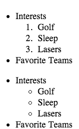
<ul>
<li>Interests
<ol>
<li>Golf</li>
<li>Sleep</li>
<li>Lasers</li>
</ol>
</li>
<li>Favorite Teams</li>
</ul>
<ul>
<li>Interests
<ul>
<li>Golf</li>
<li>Sleep</li>
<li>Lasers</li>
</ul>
</li>
<li>Favor
DO NOW | CODE ACADEMY
HTML Structure: Using Lists
Social Networking Profile – Exercises 1-7
TABLES
<table>
<tr> This tag tells each row how many cells to have.
Add a single <td>(“table data”) cell to the first row, which creates a single column. See below:
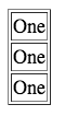 <table >
<tr>
<td>One</td>
</tr>
<tr>
<td>One</td>
</tr>
<tr>
<td>One</td>
</tr>
TO ADD TWO COLUMNS TO A TABLE SEE THE CODE BELOW:
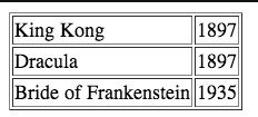
<table>
<tr>
<td>King Kong</td>
<td>1897</td>
</tr>
<tr>
<td>Dracula</td>
<td>1897</td>
</tr>
<tr>
<td>Bride of Frankenstein</td>
<td>1935</td>
</tr>
</table>
DO NOW | CODE ACADEMY
HTML Basics III
Tables
Lessons 6-10
DIV AND SPAN TAGS
DIV and SPAN tags are “structure tags”.
<div></div>
Short for “division,” <div> the div tag allows you to divide your page into containers (that is, different pieces).
<span> </span>
The span tag lets you to control styling for smaller parts of your page, such as text. If for instance you always want the first word of your paragraphs to be red, you can wrap each first word in<span></span> tags and make them any color you want.
DO NOW | CODE ACADEMY
HTML Basics III
Lessons 11-15
HTML: INSERTING IMAGES
IMAGE FILE FORMATS: Review
There are three primary image file formats used for graphics viewed on the web. Each of these file types were designed for the purpose of compressing memory usage. Each file type does this a different way. NOTE: .PSD, .AI and .INDD files will NOT show up on your website.
REVIEW FROM PHOTOSHOP
Jpeg
Jpegs work well on photographs, naturalistic artwork, and similar material; not so well on lettering, simple cartoons, or line drawings. JPEG is “lossy,” meaning that the decompressed image isn’t quite the same as the one you started with. (There are lossless image compression algorithms, but JPEG achieves much greater compression than is possible with lossless methods.) JPEG is designed to exploit known limitations of the human eye, notably the fact that small color changes are perceived less accurately than small changes in brightness.
Gif
Graphics Interchange Format. A format used for displaying bitmap images on World Wide Web pages, usually called a “gif” because .gif is the filename extension. These files use “lossless” compression and can have up to 256 colors.
Png-8 and Png-24
PNG is a compression scheme that has two main benefits: it is a lossless compression image format and it holds alpha channel information. Originally, the Portable Network Graphics (PNG) format was designed as a royalty-free format, which would replace GIF and JPEG. Png-24 allows for smooth blending between alpha and opaque.
Image Size
When speaking about image size on the web, there are three possible interpretations of this that you must take into account.
File Size refers to the amount of disk space an image occupies (in KB or MB)
Image Dimensions refers to the physical size of the image, expressed in height and width.
Resolution refers the pixel density of an image. This is expressed in pixels per inch (ppi). Images are displayed on the web at 72 dpi. Printed images are generally of higher resolution.
Resize your images in Photoshop PRIOR to uploading them on the web.
Compression
Compression shrinks down the file size of the photo so that it loads on the user’s computer quickly, but maintains a certain level of quality.
SAVING IMAGES
Saving Images Out of Photoshop or Illustrator
Both Photoshop and Illustrator have excellent options for optimizing images for the Web, via the “Save for Web” menu. It is better to use this option rather than “Save As” or “Export” options, as you will have more control over the output settings and the final file size will be smaller because no preview image is saved with the file.
Save and Export
There are two ways of saving a photo in Photoshop. The first is to use the Save As… dialogue, the other is called Save for Web & Devices… which is used to save your photos in preparation for publication to the Web.
1) Save as: FIRST, save the file type as a Photoshop or .PSD file. This will save extra Photoshop-specific information about your photo and allows you to go back to the file at a later date and manipulate all layers. You will not lose any quality when you re-save it multiple times. THEN, save as a .jpg, .png or .gif which compresses the photo allowing you to use it on the web.
2) Save for Web: Use this when you are ready to export your photo for publication to the Web. The Save for Web allows you to see how your photo will appear once it’s published to a Web site. Optimized will show you how your photo will appear once it’s published on a Web site, and 2-up/4-up will show you comparisons so you can see how the different levels of compression will affect your photo when saving. These are automated ways to save your image for the Web.
***Here’s a great reference for “save for web”.
3 Ways you can Retrieve Images to Place onto your Website
Use a third party image hosting site like Flickr.
Flickr:
Upload your image to your Flickr account and copy the image URL. To get the direct URL of an image on Flickr do the following:
Upload your own image or search and find an image already on Flickr. One you’ve got the image you want to use, right click on the image and then click on “view all sizes”. Choose your size and click on it. You’ll see the image with various image sizes listed above it. Choose your size and click on it. Right click on the image and choose “copy image URL”. NOTE: you need the direct url to image with a files extension of .jpg, .gif or .png.
<img src=”http://farm5.staticflickr.com/4081/4883281674_8428f07e53_z.jpg”>
Use a direct URL to a website.
Find your image anywhere on the web. Click on the image and then click on “full-size image”. Copy the URL and place the full URL into your HTML file.
<img src=”http://discovermagazine.com/2012/jul-aug/06-what-is-your-dog-thinking/dog1.jpg”>
Upload your own image via FTP to your own web hosting space.
Log into your web hosting space via FTP and upload your images. It’s good practice to place them inside a folder called: images.
<img src=”images/dog.jpg”>
Here’s a great resource for finding images released under Creative Commons.
ADDING IMAGES TO YOUR PAGES
Images are displayed on the web using the image tag:
<img>
This is the basic syntax for using the image tag:
<img src=”images/dog.jpg”>
You MUST upload the image to your ftp site for the web browser to find it. Use JPGs for photographs, and GIFs or PNGs for line art or most screenshots.
Create a subfolder on you FTP site called “images.” Whatever images you want to show on your web pages, upload them to this “images” folder.
The “alt” attribute is used for the text that will display if an image does not load in the browser, and in some browsers is visible when you hover over the image with the mouse:
<img src=”images/dog.jpg” alt=”Spot the Beagle” />
The image tag also allows you to input a numeric value for the height and width of an image. It is a good idea to specify the height and width, as this allows the browser to render the page faster.
<img src=”images/dog.jpg” alt=”Spot the Beagle” height=”400px” width=”200px”>
You can try it out on W3Schools.
Pulling an Image from the Web
If you’re pulling in an image from the web, view its properties to grab the absolute URL. If you are pulling in an image from a folder on your a server, call to it correctly:
Examples:
<img src="http://www.url.com/nameofimage.jpg" alt="Name of Image">This image is located somewhere else on the web.<img src="images/dog.jpg" alt="Spot the Beagle">This image is located within a folder called images on my server.Images as Links
You can use an image to link to another document by simply wrapping an image tag in a link tag:
<a href="filename.html”><img src=”image/dog.jpg“ alt="Spot the Beagle"></a>
You can see an example on W3Schools here.
DO NOW | CODE ACADEMY
HTML Structure: Tables, Divs, and Spans | IMAGES
No. 6 | Clickable Photo Page – Exercises 1-7
Background Images
You can set an image as a background in any page element. The properties of background images are detailed here:
Putting it All Together: Images and CSS
<!DOCTYPE html>
<html>
<head>
<title>HTML Images Tutorial</title>
<link rel=”stylesheet” type=”text/css” href=”style.css”>
</head>
<body>
<h1>
HTML Images Tutorial
</h1>
<h3>
There are three way to place <i>images</i> onto your HTML page.
</h3>
<ol>
<li>Use a third party web hosting space.</li>
<li>Link to an image already on the web.</li>
<li>Upload an image to your web hosting space using FTP.</li>
</ol>
<p>
Use a direct link to pull this image from <b>Flickr</b>or another image hosting site.
</p>
<div align=”left”>
<img src=”http://farm5.staticflickr.com/4081/4883281674_8428f07e53_z.jpg”>
</div>
<p>
Upload an image to your site by <b>linking</b> to an image anywhere on the web.
</p>
<div align=”left”><img src=”http://discovermagazine.com/2012/jul-aug/06-what-is-your-dog-thinking/dog1.jpg”>
</div>
<p>Or, you can <b>upload</b> an image to your web hosting space using<strong>FTP.</strong>
<div align=”left”>
<img src=”images/dog.jpeg”>
</div>
</p>
<p>
You can even use an image as a link to a <b>URL</b> anywhere on the web.
</p>
<p>Create a link of an image:
<a href=”http://www.blogcdn.com/www.urlesque.com/media/2008/11/23-pooch11.jpg”>
<img src=”images/Blinky_Dog.gif” alt=”dog gif”></a>
</p>
</body>
</html>
If you use the HTML above, you can see what the site looks like in the screenshot below.

You can see the FULL HTML page here. The HTML was upload to web space using FTP.
Image Spacing and Alignment
Let’s see how it looks when you add text. Type in “This is one crazy dog!” directly after the close of the img tag. The text will bump up against the edge of the image and wraps around the bottom of the image (depending on how much text you’ve written). To make the text wrap correctly, add an “align” attribute to the image. It’s your choice whether you want to align it to the right or left by using align=”left/right”.
In the image below I’ve added the attribute align=”left” – see the full code here: <img src=”images/dog.jpeg” align=”left” />

A Simple Thumbnail Gallery
This method creates a flexible grid of thumbnail images and captions that dynamically fills rows based on the browser width. This is what it looks like in action:
Each thumbnail and caption is part of an unordered list (ul) with the id “thumbnails”. The list items (li) are set to display:inline and float:left and have background, margin and padding set to create the white boxes around them.
Rounded Corners
It seems like the trend nowadays are images that have rounded corners. If you don’t want to manually do it in photoshop or illustrator, use this online service called RoundPic.
View the links below to learn more about rounded corners and background images.
Embedding Multimedia
Playing Quicktime and Flash Movies
The QuickTime format is developed by Apple. Videos stored in the QuickTime format have the extension .mov.
QuickTime is a common format on the Internet, but QuickTime movies cannot be played on a Windows computer without an extra (free) component installed.
With the object element, code that will play a QuickTime movie can easily be added to a web page. The object can be set to automatically install a QuickTime player if it is not already installed on the users computer.
If you use a third-party service like Youtube, Vimeo, Google, or blip.tv, you can just copy their embed code and paste it into your .html file.
<iframe width=”640″ height=”360″ src=”//www.youtube.com/embed/rmTg-qHcGs4″ frameborder=”0″ allowfullscreen></iframe>
EMBEDDING AUDIO
There are several different types of music formats that are used…so which one do we use for the web?
The WAVE format is one of the most popular sound format on the Internet, and it is supported by all popular browsers. If you want recorded sound (music or speech) to be available to all your visitors, you should use the WAVE format.
The MP3 format is the new and upcoming format for recorded music. If your website is about recorded music, the MP3 format is the choice of the future.
ADDING INLINE SOUND
When sound is included in a web page, or as part of a web page, it is called inline sound.
If you plan to use inline sounds in your web applications, be aware that many people find inline sound annoying. Also note that some users might have turned off the inline sound option in their browser.
My best advice is to include inline sound only in web pages where the user expects to hear the sound. An example of this is a page which opens after the user has clicked on a link to hear a recording.
So if you insist… you just need to use the tag.
<embed src="beatles.mid" />
HYPERLINKING SOUND
If a web page includes a hyperlink to a media file, most browsers will use a “helper application” to play the file.
The following code fragment displays a link to a music file. If a user clicks on the link, the browser will launch a helper application and play the music file.
<a href="nameofyoursong.wav">Play this tune</a>
WHAT IS CSS?
Introduction to CSS
CSS adds styles to your web pages: it’s the skin over the bones of HTML. This tutorial will teach you how to style our webpages.
CODE ACADEMY LESSON IV
The basics: what CSS is, how it works, and why we separate form from function.

The CSS syntax is a little different from the tag and attribute format of HTML. A CSS style is made up of a selector, which is the HTML element or class name you wish to define rules for, and a set of properties and values. A property and its value are separated by a colon (:). You can define multiple properties for a style, separating them with a semi-colon(;). Property/value sets are enclosed in brackets{}.
For example, if you wanted to redefine all HTML in your <p> tags to look like this, then your style would look like this:
p {

color: #00CC00;

font-size: 13px;

font-family: "Courier New", Courier, monospace;

font-weight: bold; text-decoration:none;

}
The order of properties doesn’t matter, as long as you separate them with a semi-colon. Property values that have multiple words are surrounded by double quotes: “Courier New”.
You can apply the same style to multiple selectors by grouping them:
h1, h2, h3, h4 {
color: #00CC00
}
There is a full CSS reference and extensive code examples at:
also at: http://www.barelyfitz.com/screencast/html-training/css/positioning/
CODE ACADEMY LESSON IV
Now that you know what CSS is, it’s time to learn how to use it.
Sizing in CSS
There are a number of different measurement schemas within xHTML / CSS. Which one to use depends on context, and you can mix and match them.
px – number of pixels, relative to the screen size. This is the most consistent across machines, browsers, monitors% – percentage of the total width or heightem – size relative to the em size of the base fontWe will go into when it is appropriate to use the various schemes in later weeks. For now, use the px units in your stylesheets.
CODE ACADEMY LESSON IV
3. Details, Details
You’ve got basic CSS under your belt—now we’ll cover some of the finer aspects.
The three types of HTML elements to apply styles to:
An important concept to understand is that there are basically three types of HTML tags: block-level elements, inline elements, and replaced tags.
h1-h6, p, div, ul, ol, blockquote.a, b, strong, italic, em, spanIf an element is not explicitly defined, it is known as an anonymous element.You will not be able to style this element directly.
CLASSES AND IDS
Classes and Ids are a way to designate specific elements in your HTML. You can apply either a class or id or both to any element:
<div id="navigation">
<p>
There is one key difference between a classes and ids:
When naming classes and ids, it is good practice to name them logically and semantically. The names should not describe the physical attributes of the style you plan to apply to them, but the type of thing that they are in the structure of your page. For example, if you have a unordered list of links that will serve as your navigation, this:
<ul id = "navigation">
is better than this:
<ul id = "top">
The reason for this once again we want to separate the structure from the presentation. Naming your classes and ids logically means that if you radically change the color scheme or layout defined by your style sheet, the structure will still make sense.
3 WAYS TO USE STYLE SHEETS
There are three methods of accessing style sheets from your HTML:
Here is an example of a page that uses inline and embedded styles:
We are going to focus primarily on using external style sheets. The are a couple of advantages to this. First, you can apply the same styles to some or all pages of your site. Second, you can make a change on the external style sheet and all the pages it is linked to will change. And last, with a simple change to your code, you can switch style sheets and completely alter the look of your page.
Style sheets work in 4.x or later browsers (but still not consistently) such as Navigator 4.5 or 6 and IE 4 or 5. Most earlier browsers ignore them.
A good place to see style sheets in action, and to really understand how powerful they are, is the CSS Zen Garden.
CREATING AND LINKING TO YOUR OWN EXTERNAL STYLE SHEET
An external style sheet is a plain text document containing all the style declarations you wish to apply to the linked pages. It does not have the structural tags (html, head, body) that your HTML documents have.
Once you have created your style sheet, you can associate it with your page using the link tag in your HTML, placed between the <head> tags:
<link href="styke.css" rel="stylesheet" type="text/css"/>
MANIPULATING BASIC CSS PROPERTIES
This tutorial covers how to group CSS selectors into classes or identify a single selector by ID.
CSS Selectors: 23 exercises
WEB DEVELOPER ADD-ONS
There is an excellent suite of Firefox and Google Chrome add-ons that will help you in your site development. We’re going to install them now, and I highly recommend that you install them on your home machine:
As the course goes on, we are going to learn to use the various tools included in the suite.
VALIDATING YOUR CODE
It is essential to make sure that you are writing valid xHTML code. Improperly formatted code can cause your pages to render in unpredictable ways or not at all in various browsers.
The W3C offers a free validator that you can run any html page through:
You can also access the validator through the “Tools” menu in the Web developer toolbar.
HOMEWORK | WEEK 14
CODE ACADEMY | SOCIAL MEDIA NETWORKING
If you ohaven’t already done so, complete the social media networking section under the course.
HTML Structure: Using Lists. It’s listed as number 4.
CODE ACADEMY | LIST WITHIN LIST
On one of your pages create a list within a list using ordered and ordered list.
CODE ACADEMY | TABLES
On one of your pages create three tables.
CODE ACADEMY | Clickable Photo Page
HTML Structure: Tables, Divs, and Spans
No. 6 | Clickable Photo Page
Create a NEW html page called portfolio.html and create a clickable photo pages using images you created from the Photoshop and/or Illustrator section of the class. Upload it to you site.
CODE ACADEMY | Introduction to CSS
No. 7 | CSS AN OVERVIEW
NO. 8 | DESIGN A BUTTON ON YOUR WEBSITE
CODE ACADEMY | CSS Classes and IDs
NO. 9 | CSS SELECTORS
NO. 10 | SORTING YOUR FRIENDS
Rounded Pictures
Add at least three rounded photos on your portfolio page.
EMBED VIDEO
Add a video to any page on your website.
EMBED AUDIO
Go to Sound Cloudand find any sound, copy the source code and embed it on any page.
CSS
USING THE WHAT IS CSS? VIDEO WE WATCHED INN\ CLASS —
Go to one of the html pages you already created and add three div’s that corollate to three div styles in the style.css page you created.
W3 SCHOOLS
This is a great resource site, I’m going to be referring to it a lot this class and in the future. If you are ever stuck for how to do something, start here:
http://w3schools.com
FILE NAMING CONVENTIONS AND INDEX.HTML
There are a few rules that govern the naming of web files and directories:
All Web page files must end with .html or .htm. These extensions are interchangable, but generally we use .html
Names are case sensitive. This means that Bio.html and bio.html will be considered by the server as two different files.
Spaces and non-alphanumeric characters are not allowed, with the exception of underscore (_) and hyphen (-)
The “home” page of a Web site is always called index.html or index.htm. If this file does not exist, you will either get an error or see a directory listing of the root directory, depending on how the Web server is configured.
My suggestion to all of you is that you come up with a naming convention for yourself now, and stick to it. This will avoid a lot of problems later on! For example, my naming convention is to use all lowercase letters, and to use underscores instead of spaces:
my_name.html
MANAGE YOUR SITE: REMOTE VS. LOCAL FILE SYSTEMS
When we build a Web site, we develop them on our local (or “desktop”) machine, and publish them to a remote “Web server”. A Web server is a computer that is essentially the same as your desktop machine, but has server software installed that allows it to take http requests from an internet user’s computer (or “client”), and deliver the requested html document to the user’s browser. This client / server relationship is the basis of all Web activity.
What we call a “site” is really just a collection of html documents that we associate via internal references (links) between them. In order to keep your site organized, and to ensure that it functions exactly the same online as on your desktop, you must keep the file and directory structure exactly the same on the local and remote machines.
The first step in doing this is to organize your local file structure. First, create a “root” folder on your local machine or flash drive from which you are going to work. This folder could be named for the course (digitalmediaproduction) or your username (najlahhicks). It doesn’t matter what the name is at the top level.
For the beginning of this class, I’m going to dictate a file structure that I want you all to use.
Within your root directory, create two directories:
working_files
public_html
From now on, the “working_files” directory will hold documents and images that you use as resource files for building your site, but not any files that will uploaded to the site itself. Put the resume text file that you brought today into this directory.
The public_html directory will contain all files that will actually become part of your site. Put the bio html file that you created as homework in that directory now.
Within the html directory, also create a subdirectory called:
images
We will use this directory later in the course to store any images that will appear in your web site.
UPLOADING YOUR FILES USING FTP/SFTP
Your html files are uploaded to the Web server using FTP, or File Transfer Protocol. You will need an FTP client to do this. If you are using the A server, you will need a program that supports SFTP, or Secure File Transfer Protocol. Here are likes to some popular programs:
Fugu (MAC) – This program is free.
Fetch (MAC)
CyberDuck (MAC) – This program is free.
FileZilla (PC) – This program is free.
All these programs function essentially the same. To connect to your remote server, you enter the address of the FTP server, your username and password.
***NOTE: You can upload files through the Bluehost file manager.
Intro to HTML
HTML is the language of Web browsers. HTML stands for HyperText Markup Language. HTML is a simple scripting language originally designed to allow nonlinear navigation of large text documents. It is constantly undergoing revision and evolution to meet the demands and requirements of the growing Internet audience under the direction of the W3Schools, the organization charged with designing and maintaining the language.
HyperText is the method by which you move around on the web. Clicking on specially coded text called hyperlinks navigates you to other pages. The term hyper indicates that the hierarchy of the pages is not linear — i.e. you can go to any place on the Internet whenever you want by clicking on links — there is no set order to do things in. Markup refers to HTML “does”.
HTML Syntax
All HTML syntax is composed of discreet pieces of code called elements. Elements are made up of paired opening and closing tags.
FILE NAMING CONVENTIONS AND INDEX.HTML
There are a few rules that govern the naming of web files and directories:
All Web page files must end with .html or .htm. These extensions are interchangable, but generally we use .html
Names are case sensitive. This means that Bio.html and bio.html will be considered by the server as two different files.
Spaces and non-alphanumeric characters are not allowed, with the exception of underscore (_) and hyphen (-)
The “home” page of a Web site is always called index.html or index.htm. If this file does not exist, you will either get an error or see a directory listing of the root directory, depending on how the Web server is configured.
My suggestion to all of you is that you come up with a naming convention for yourself now, and stick to it. This will avoid a lot of problems later on! For example, my naming convention is to use all lowercase letters, and to use underscores instead of spaces:
my_name.html
HTML Syntax
All HTML syntax is composed of discreet pieces of code called elements. Elements are made up of paired opening and closing tags.
Tags
Each tag has a specific meaning that communicates to the browse what it should do with the content between the opening and closing tag. For example, the <b></b> tag tells the browser to make bold all text contained between its opening and closing tags.
Tags are the cornerstone of HTML. Tags are instructions to the Web browser that dictate the display of text, images and other elements on the page and are not visible when the page is displayed to the user. You can recognize an HTML tag because it appears in between greater than and less than signs:
<tagname>
There is a large set of pre-designated tags within HTML. Today we are going to cover the basic tags needed for building a basic HTML page and formatting text.
There are two types of tags, container tags and non-container tags.
Container tags appear in pairs, as an opening tag and as a closing tag, like so:
<tagname> </tagname>
Everything contained between the opening <> and closing </> tags is subject to the tag properties.
Non-container tags appear singly, and are what is called “self-closing.” This means that they do not appear in sets, but only as a single tag. In this case, the page content affect by the tag is all contained within the single tag, like so:
<tagname tagcontent />
Note: Previous versions of HTML did not require the closing “/” character at the end of the non-container tag, and it will generally function correctly in most browsers without it, but for the specification we will be using as the standard for this class, you will need to include this.
Attributes
In the language of HTML, attributes serve to modify tags, much like an adjective modifies a noun. As the name implies, attributes are properties of the tag. Each tag has properties that can be changed via the use of the attributes that are associated with it. Attributes follow the tag name within a tags opening component, in between the greater than and less than signs, like so:
<tagname attributename=”value”>
The order of attributes is not important. You can place as many attributes inside a tag as is needed:
<tag attribute1=”value1″ attribute2=”value2″ attribute=”value3″>
Page Structure
In order for a Web browser to recognize a file as an HTML document, it must contain the proper structure. At the minimum, it must contain five basic tags. These tags must appear in the correct order. The page structure tags are as follows:
DOCTYPE tells the Web browser which HTML or XHTML standard your document is written to. For this class, you should use XHTML5 transitional. This is the first thing that should appear in any HTML document that you write.
<!DOCTYPE html>
Always use the code exactly as it appears above.
The <html> tag comes next. It encloses all other tags and content on the page, and further serves to instruct the browser that what is being rendered on the rest of the page. You should use this format for the html tag:
Third is the <head> tag which contains information that is not displayed in the browser window. For instance, a head tag may include information that search engines may use to find the page.
The <title> tag contains the text that appears in the title bar of the browser window. It is nested within the head tag.
The <body> tag contains all of the information to be displayed by the browser.
Using these tags, you can build a basic page structure:
<!DOCTYPE html>
<html>
<head>
<title>My First HTML Page</title>
</head>
<body>
Anything inside the body tags will appear on your Web page.
</body>
</html>
Use this template as the basis for all of your HTML pages!
To make your own Web pages, start with the code above. HTML pages can be created in any Plain Text Editing application. DO NOT use Microsoft Word, as it will add extra formatting that will break your code. Here are links to several text editors that you can download and use to create your pages:
DOCUMENTS MUST HAVE LOGICAL STRUCTURE
All XHTML elements must be nested within the <html> root element. It is the element from which grows the document tree. All other elements can have sub (children) elements. Sub elements must be in pairs and correctly nested within their parent element. Within the html element there are two necessary “child” elements: the head element and the body element.
Logical Markup Example (Using semantic markup to describe content.)
<!DOCTYPE>

<html>

<head>
<title>Working with Structure</title>
</head>
<body>
<h1>Welcome</h1>
<p>Welcome to the site where structure matters!</p>
<h2>Getting Into Structure</h2>
<p>In order to begin working with structure, you need to be aware
of:</p>
<ul>
<li>DOCTYPE declarations</li>
<li>Properly structured head and body components</li>
<li>Logical structures for content markup</li>
</ul>
</body>

</html>
VIEWING THE DOCUMENT TREE
When you have a more semantic document, you can easily visualize it via the document tree, which is a map that reflects where elements go within the structural hierarchy of the document. This tree becomes critically important when using CSS because of the concept of inheritance.

Document root: html
ELEMENTS MUST BE PROPERLY NESTED
In HTML some elements can be improperly nested within each other like this:
<strong><em>This text is bold and italic</strong></em>
In XHTML all elements must be properly nested within each other like this:
<strong><em>This text is bold and italic</em></strong>
TAG NAMES MUST BE IN LOWER CASE
This is because XHTML documents are XML applications. XML is case-sensitive. Tags like <p> and <P> are interpreted as different tags.
This is wrong:
<BODY>

<P>This is a paragraph</P>
</BODY>
This is correct:
<body>

<p>This is a paragraph</p>

</body>
ALL XHTML ELEMENTS MUST BE CLOSED
Non-empty elements must have an end tag.
This is wrong:
<p>This is a paragraph
This is correct:
<p>This is a paragraph</p>
Empty Elements Must also Be Closed
Empty elements must either have an end tag or the start tag must end with />.
This is wrong:
This is a break<br>
This is correct:
This is a break<br />
IMPORTANT Compatibility Note:
To make your XHTML compatible with today’s browsers, you should add an extra
space before the “/” symbol like this: <br />.
THE <!DOCTYPE> IS MANDATORY
An XHTML document consists of three main parts:
The XHTML standard defines three Document Type Definitions.
You must select a DOCTYPE and follow the guidelines of that DOCTYPE. The browser will attempt to render your page in standards-compiant mode, following the XHTML and CSS recommendations. If you don’t follow the DOCTYPE guidelines or don’t define a DOCTYPE at all or incorrectly the browser will enter “quirks mode” and render your pages as they might appear in an older browser.
The most common DOCTYPE is the XHTML Transitional.
<!DOCTYPE html PUBLIC "-//W3C//DTD XHTML 1.0 Transitional//EN"

"http://www.w3.org/TR/xhtml1/DTD/xhtml1-transitional.dtd">
Another DOCTYPE we will use is XHTML 1.0 Strict:
<!DOCTYPE html PUBLIC "-//W3C//DTD XHTML 1.0 Strict//EN" "

http://www.w3.org/TR/xhtml1/DTD/xhtml1-strict.dtd">
BASIC TAGS CONTINUED
Last week we introduced the basic page tags and the <p> tags. Today we are going to learn the rest of the most commonly used tags.
There are two types of HTML formatting tags: inline and block level tags. These two types have slightly different behaviors.
Inline tags
These tags are designed to enclose content that is part of another element. Generally they are used when you want to affect just part of the text in a paragraph. There are just two inline tags we are going to talk about today.
Bold text:
<strong></strong> or <b></b>
Italic text:
<em></em> or <i></i>
Line breaks:
This is a self-closing (non-container) tag. This will create a single line break wherever it is placed in the code:
<br />
Block level tags
These tags are used to control blocks of content. The main characteristic that differentiates block from inline is that block level elements appear by default with a line break before and after them. Here are the most common block level tags you will work with:
The six heading levels:
<h1>Heading 1</h1><h2>Heading 2</h2><Hh3>HEADING 3</h3><h4>Heading 4</h4><h5>Heading 5</h5><h6>Heading 6</h6>Again, the paragraph tag:
<p></p>
LISTS
There are several tags that you can use to create a “list” of items which is a very important way of organizing content. When used in combination with CSS, lists are a great way to create navigation menus. The tags below are a little different than the tags above in that you must use two distinct tags to create the list, one that contains the entire list, and one that contains each item in the list. Let’s look at
There are three types of lists: unordered, ordered, and definition.
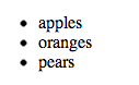
Unordered List
This tag, enclosing all list content, creates a bulleted list.
The code:
<ul>
<li>apples
<li> oranges</li>
<li>pears</li>
</ul>
This is how the list would look:
This is a LIST with an a href which makes your list a LINK.

NOTE: Inside the <ul> or <ol> tages, you use a set of tags, enclosing each line, or “list item” item:
<li></li>
Unordered List
This is how it would look on the web.

This is how it would look written in Text Wrangler.

This is the code you would use:
<p>This is an example of an unordered list.</p>
<ul>
<li>Unordered information</li>
<li>Ordered information</li>
<li>Definition lists</li>
</ul>
Ordered List
This tag, enclosing all list content, creates a numbered list:
<ol></ol>
To make an ordered list, like this:
Use this code:
<ol><li>Monday</li><li>Tuesday</li><li>Wednesday</li><li>Thursday</li><li>Friday</li></ol>
Definition List
This tag involves a main phrase, and then a definition for that phrase that appears indented and appearing on a separate line.


Use this code:
<dl>
<dt>This names an item</dt>
<dd>This defines the item names</dd>
<dt>This names another item</dt>
<dd>This defines the other item named</dd>
</dl>
To create an unordered list, like this:Use this code:
<ul>
<li>Unordered information</li>
<li>Ordered information</li>
<li>Definition lists</li>
</ul>
Common Link Types
Link to launch a new window <a href=”newpage.html” target=”_blank”> Link to launch email application<a href=”mailto:myname@email.com”>
<a href=”mailto:myname@email.com”>email me now</a>
OR
<a href="mailto:someone@example.com?Subject=Hello%20again">
Send Mail</a>
When someone clicks on the the “Send Mail”, the email field will pop up.
Anchor Links to a specific place on the same page
<a name=”top”></a>
= an anchor must be indicated in a single, specific spot on the page
<a href=”#top “>Return to Top</a> = a link with “#” before the name that was applied to the anchor link specified in another part of the page.
All the basic tags in one document
NESTED ELEMENTS RULES
Important Note! With the exception of div, you cannot nest one block-level element inside of another. For example, this is wrong:
<p><h1>You can't put a heading inside a paragraph!</p>
But this is ok:
<div><p>You CAN put a paragraph inside a div!</p>
You can nest inline elements inside each other:
<strong><em>I can make this text bold and italic!</em></strong>
And you can nest inline elements inside block-level elements:
<p><em>I can make this paragraph italic!</em></p>
But you can never nest a block-level element inside an inline element:
<em><p>This is wrong!</p></em>
AND you can never nest a block-level element inside a list element:
<li><p>This is wrong!</p></li>
SPECIAL CHARACTERS AND NON-BREAKING SPACES
Text characters that are outside the normal ASCII character set must be represented in html via special character codes. This includes things like em dashes, curly quotes, ampersands, etc. These special character codes always begin with an ampersand (&) and end with a semi-colon(;). For example, an em dash (—), would be represented in your code like this:
—
or
—
One especially useful special character is the non-breaking space:
Put this character in your code when you want to have more than one white space in a row. However, do not use it to create indented or tabbed formatting, we’ll learn how to do that later!
For a full list of character codes, visit W3School’s Special Characters Reference.
LINKING FILES
File linking is done through the use of the <a> or anchor tag.
Use the following syntax for linking to another document:
<a href="URL_of_target_document">link_text</a>
For example, if you were to link to Google, you would use the following code:
<a href="http://www.google.com/">Google</a>
To link to an email address, which will spawn the user’s designated email client, you simply need to add the “mailto” parameter:
<a href="mailto:emailaddress@server.com">email_text</a>
You may also link to “anchors” in the same file.
To do this, you must create both the link:
<a href="filename.html#anchor_name">anchor_text</a>
and the anchor to link to:
<a name="anchor_name">anchor_text</a>
Absolute vs. relative linksWhen citing the URL of the target document, you may use an “absolute” or “relative” path.
An “absolute” path is the full web address of the document, with protocol. This path will not change depending on the document that is linking to it. This type of link is primarily used when you are linking to an address that is external to the site you are linking from.
For example, the absolute path of this site is:
A “relative” path is one where the information is given relative to the document on which the link appears. This type of linking will only work within a given site directory, it can not be used for external URLs.
With relative links, you must be aware of where the document is located in the file directory in relation to the file being linked to.
In the same directory:
filename.html
In a lower (sub) directory:
subdir_name/filename.html
In a higher (parent) directory:
../filename.html
Relative to the site root:
/filename.html
(note: it is unusual to use paths relative to the site root)
LINK TARGETS
Unless instructed otherwise, a Web browser will open a target document in the same window as the linking document. The user of the “target” attribute allows you to direct the target document to an alternate window. Some of the attributes below only apply to framesets, which we will cover briefly later in the course.
_blank Opens the linked document in a new window
_self Opens the linked document in the same frame as the link
_parent Opens the linked document in the parent frameset
_top Opens the linked document in the main browser window, replacing all frames
name Opens the linked document in the window with the specified name
Common Link Types
Link to launch a New Window
<a href=”newpage.html” target=”_blank”>
Link to launch email application
<a href=”mailto:myname@email.com”>
Anchor Links to a specific place on the same page
<a name=”top”></a>= an anchor must be indicated in a single, specific spot on the page
<a href=”#top “>Return to Top</a> = a link with “#” before the name that was applied to theanchor link specified in another part of the page
Complete HTML Structure: Using Lists in Code Academy
This unit covers more advanced HTML structure and teaches you how to customize your pages.
HTML Basics II: 16 exercises
COMMENTING YOUR CODE
You can place a comment tag in your HTML to put a note into the code that will not be rendered by the browser. This is especially handy in a long and complex page. A comment is formatted as follows:
<!-- This is a comment -->
Everything between the <!– and –> tags will be hidden from the browser, but visible when you view the source.
COLOR
All color in Web pages, whether it is in text, background color, or other interface elements, is expressed in the HTML via hexidecimal codes. These codes consist of a # followed by 6 letters and numbers. For example, the code for white is #FFFFFF.
Below are two excellent references for the hex codes for the Web-safe palette.The Web-safe palette is a collection of colors that have been determined to be consistently rendered across boundaries.
Webmonkey Color Code Chart
Visibone Webmaster’s Palette
FONTS
Because a Web browser can only utilize those fonts installed on the end-user’s machine, there are a limited number of fonts reliably available across platforms. Here’s an up-to-date list of them:
You should only use these fonts, or generic font designations, in your style sheets.
Here is a great resource for viewing how Web fonts will look in a browswer:
META DATA
Meta data is located within the <head> of a web page. Your meta data is basically information that you insert that explains what this page/site is all about. Copy and past the code text below into your head:
<meta name="keywords" content="HTML, DHTML, CSS, XML, XHTML, JavaScript, VBScript"><meta name="description" content="Free Web tutorials on HTML, CSS, XML, and XHTML"/>Homework | Week 12
CODE ACADEMY
To review what we learned last week, go to Code Academy and create an account. Complete the following exercises:
Introduction to HTML
This unit will introduce you to the basics of HTML, the language used to create websites.
HTML Basics: 13 exercises
HTML Structure: Using Lists
This unit covers more advanced HTML structure and teaches you how to customize your pages.
HTML Basics II – 16 exercises
BE SURE to take a screen shot of each tag at the end of the lesson and add that to your homework page.
Create a NEW folder on your desktop called webdesign
inside that folder use Text Wrangler to create a page and save it as index.html Upload that folder to the public_html folder on your website. Create a list and add an A HREF link to three more pages, artist.html, bio, html and resume.html. Create hyperlinks to your artist, bio, resume pages on this page.
BIO.HTML
Using the basic page template that you saved in class today, create an HTML page that contains a short bio of yourself. Save the file with the following name: bio.html – upload it to your folder called webdesign Use all of the new tags we learned today to format your resume.
RESUME.HTML
Using the basic page template that you saved in class today, create an HTML page that contains a resume of yourself.
Save the file with the following name: resume.html – upload it to your folder called webdesign Use all of the new tags we learned today to format your resume.
ADD
Please post it on YOUR site. Here is an example of a resume.
ARTIST.HTML
HOMEWORK.HTML
LIST
Create a LIST at the top of each page (just inside the body tag) with the names:
index.html
resume.html
artist.html
1. DELICIOUS
Tag THREE websites on del.icio.us that are relevant to web design and specifically to what you learned in class today. It can be a tutorial, an article, a design blog or anything else that you think would be useful as a reference. Write a note in the comment section about why you think each one is a useful resource.
REFERENCE: The following three (3) reference articles are great resources…
Webmonkey – HTML Cheatsheet http://www.webmonkey.com/webmonkey/reference/html_cheatsheet/
Webmonkey – Stylesheets Guide http://www.webmonkey.com/webmonkey/reference/stylesheet_guide/
Brett Merkey – Most Useful CSS Properties with Examples http://home.tampabay.rr.com/bmerkey/cheatsheet.htm
The Elements of Design
Photoshop Project II
DO NOW
Buttons, Bars & Tabs
Techniques for creating navigation elements.
Watch video and complete button tutorial. View it here.
DO NOW
Watch video and complete tutorial.
Ribbons and Banners
DO NOW
Tiled Backgrounds and Seamless Textures
Watch video and complete tutorial.
DO NOW
Shadows
Watch video and complete icon tutorial.
Week 11 | Homework
Delicious
On your del.icio.us account tag three Web Sites that focus on Photoshop
Photoshop Project III
Photoshop Project III – Following Items Due – Week 12 Monday
All project files including Word document and DropBox link.
Information Architecture
The role of an Information Architect in Web development is to develop the structure, labeling, and navigation schemes of the site. This phase is alternately known as Interaction Design and Experience Design and Information Design.
The Site Outline is the first step in this process. Now we are going to visualize our Information Architecture in the form of a Functionality Specification or Functional Spec.
With the Functional Spec you create a blueprint for your site much the way an architect does for a building. The purpose of this spec is to synthesize needs identified in the requirements document into a concrete plan for development. It includes a visual map of the overall hierarchy and flow of your site, and detail views for each interface or page. At this point in the process, we are not concerned with the graphical interface of images, colors, and fonts that will go into your site, but the outlining basic structure and functionality.

WEB DEVELOPMENT PROCESS
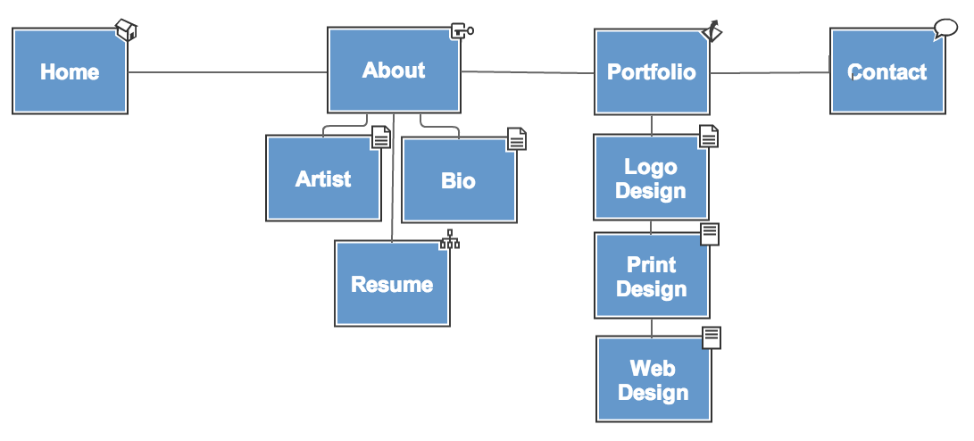
Site Map
A site map is a flow diagram of the pages contained in your website. This is the essential information architecture needed to build your website.
Tips for creating usable navigational systems:
Navigation should:
Usability First is a great resource for developing your website. Go to this link and READ IT!
Your impulse as a designer may be to skip the functional spec and jump right into graphic design. The problem with this is that it is too easy to get caught up in aesthetic decisions which can overshadow the functionality and usability of your site.
Here’s an example of what a sitemap could look like.
You can create your sitemap using any number of different tools. Here are a couple of great tools used to create sitemaps. Great designer resources.
Create an outline of your website and include:
#1. DO NOW – Create a SITE MAP for the Charity Water homepage.
CREATING A FUNCTIONAL SPEC
For our purposes, the Functional Spec will consist of a Site Map (or Site Flow) and a set of Wireframes.
The Site Map is a visual representation of all the pages of the site and how the user navigates through them.
A Wireframe is a diagram that represents the layout, content, and functionality of each page.
You can create these documents in any drawing or page layout program you are comfortable with. A great resource for making wireframes is Google’s Mockingbird. It’s a Google Chrome add-on.
Wire frame: Where Content Elements Appear Within the Page
Wireframes are rough illustrations of page content and structure, which may also indicate how users will interact with the website. The first step is to great these diagram to establish page layout and then you will move to the visual design. Wireframes are useful for communicating early design ideas showing exactly what information, links, content, promotional space, and navigation will be on every page of the site. Wireframes may illustrate design priorities in cases where various types of information appear to be competing.
Since a site map does not indicate any hot links that may appear within a page, your wire frame will help you to determine how a user will navigate through your site beyond the main navigation. The purpose of a wire frame is to determine where each content piece will be displayed on the page, and which pieces will be displayed most prominently.
You do not need to worry about how each piece will look. The wire frame example below uses a tabbed navigation approach, however this visual is merely a placeholder and the designer may take a totally different aesthetic approach once the design phase begins.
Hand-drawn Wireframe
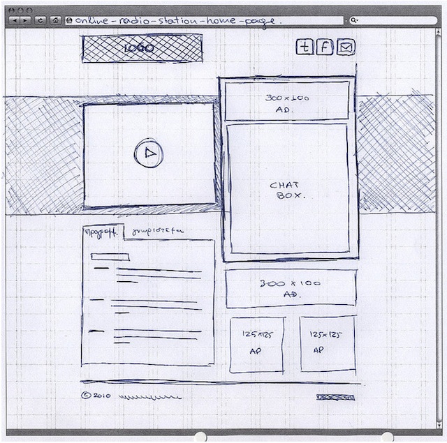
Grid Design of a Wireframe
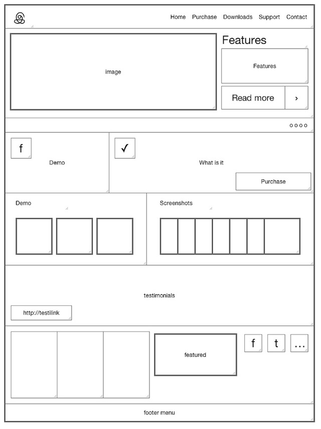
#2. DO NOW – Create a HAND DRAWN WIRE FRAME for the Charity Water homepage. Then, using Photoshop, create the grid layout for the Charity Water homepage.
INTERFACE DESIGN PRINCIPLES
Ok, we’ve gone through the Discovery phase, and determined what we want our site to be, who it is for, and what it is going to contain. We’ve mapped this all out in our functional spec. Now its time to bring to life with the next step in the Design Phase, known variously as Interface, Visual, and Graphic Design.
Function First. A Web site is like a chair. Aesthetics don’t make up for poor usability. That beautifully carved and varnished cherry wood contraption in the corner is no good if you can’t sit in it.
Your interface is a frame for the content of your site. Just like a piece of fine art, the frame shouldn’t overshadow the picture.
Don’t make me think. Your Web site isn’t a puzzle for your users to solve. When they hit the home page, it should be immediately apparent what they can do next. Think about it, when you go to a Web page, do you carefully read every word and weigh your options before clicking to the next page, or do you quickly scan and take a shot at the best guess for what link or button will get you what you want?
Don’t reinvent the wheel, unless what you really need is a jetpack. At this point, Web designers have figured out the best solutions to the basic Web problems. And, visitors to your site spend 99% percent on other peoples sites. So give them something familiar.
Where am I? Where can I go from here? Clear, persistent navigation is crucial to a successful site.
PAGE SIZE
Unlike a printed page, you can not predict or truly control the amount of pixels you users will see. Here’s a few quick stats to check out:
2013 Monitor resolutions:
MOST POPULAR USED screen resolution: 1366 x 768
1280×800 – 18.7%
1024×1024 – 11.5%
1200×800 – 10.7%
1920×1080 – 8.1%
(These stats are from The Counter)
To further complicate things, now many users have the ability to view the Web through mobile devices. The iPhone, for example, has a screen size of 480×320.
You’ve got two main options:
Regardless of which size you decide to go with, building to optimal page size means keeping key elements “above the fold.” Key elements include navigation, branding, and enough page content for the main points to get across. Remember, users will scroll horizontally or vertically but rarely both. Additionally, they don’t want to scroll through more than a couple of screens of content. Pages longer than that should be broken up. The maximum visible page area is actually smaller than the screen size due to browser interface elements.
A few good links
CREATING A DESIGN MOCKUP
Creating a template
#3 DO NOW – Create a STYLE FRAME for the Charity Water homepage.
Resource links for this phase:
Here’s an example of a multi-page design comp:
Here’s what the actual site looks like when fully design an coded.
Good resource: 10 Tips for Creating Website Mockups
#4. DO NOW – Complete the video tutorial below.
Designing a Website
Week 11 | Homework
Delicious:
Complete the FOUR Do Now Tutorials listed:
Save the PSD to the Charity Water Style Frame folder on your DropBox. Upload the JPG’s to Flickr and your website Week 10 Homework post.
Delicious
On your del.icio.us account tag three Web Sites that focus on Photoshop CS 6.
Photoshop Project II – Following Items Due – Week 11
Animated Button Timeline in Photoshop CS6
*****THE VIDEO TUTORIAL IS MUCH EASIER TO WATCH AND CREATE THAN THE WRITTEN INSTRUCTIONS**
PS CS6 Animated Button TUTORIAL

To set the duration of the animation, at the far right corner of the Timeline, you’ll find the Work Area end point, which you can drag to the last keyframe that you created.

And finally, if you want your animation to loop, rather than just play once, under the Timeline menu at the top right, you can choose to loop the playback.

Once your animation is complete, you can either render it out as a video with the Render option at the bottom of your Timeline, or you can save it as a Gif for use on the web. Under the File menu, you’ll find the Save for Web option. Once you select Gif, at the bottom, you can choose wether it plays back once, or forever. Don’t worry if the preview looks choppy. Once it’s saved, you’ll have a nice, smooth animation.

Banner Design for the Web
Advertising is everywhere, and with Google ad words, Facebook ads, and sponsored Twitter tweets, advertising on the Web is the future. Many site generate 100% of their revenues directly from banner ads.
Examples
CSS Remix
The ads on CSS Remix are displayed along the top of the site and blend in well with the site listings.
Design Bombs
Design Bombs displays their 125px ads on the left-hand sidebar. The ads fit in with the other gallery listings on the site.
Behance Network
The Behance Network website design has small sponsor boxes down the right-hand column that display ads next to their content.
Here are some useful design tips:
DESIGN RESOURCES
Standard Web Banners
Banner Ads: Excellent Examples for Inspiration
Designing a simple website banner with a logo TUTORIAL

Follow the below steps to create the above website banner :
Step 1 : Creating the banner size
Open a new file by clicking on File>Open. Make the file size width of 780px and height of 120px. You can go till 140px for the height. You can make a banner flexible according to your design.
Step 2: Giving the background color
Create a new layer. Name it bgcolor. Give a background color by doing the following:
 Paint Bucket Tool seen in the tools panel on the right.
Step 3 : Giving the inside background color
Create a new layer. Name it insidecolor. Select  Rectangular Marquee Tool seen in the tools panel on the right. Make the rectangle size width of 760px and height of 100px inside the background. Fill it with color # C64866 using the paint bucket tool.
Step 4 : Creating the logo background
Create a new layer. Name it logobkg. Select Rectangular Marquee Tool. Make the rectangle size width of 120px and height of 100px. Put the rectangle in the left side of the banner. Fill it with black color # 000000.
Step 5 : Creating a logo using the custom shape tool
Create a new layer. Name it logo. Choose the  custom shape tool seen in the tools panel on the right. Click on the Shape drop down menu seen on the top toolbar. Click on the arrow and select Ornaments. Look for the ornament which is in the banner.
Drag it in the logo space and position it so it comes in the middle of the logo background. Now you have a temporary ornament as a logo which can be replaced with your company logo if needed.
Step 6 : Creating the vertical lines in the banner
Create a new layer. Name it band. Select Rectangular Marquee Tool. Make the rectangle size width of 7px and height of 120px. Put the rectangle in the middle of the banner. Fill it with color # E8B0BD. Make four copies of the layer band.
Step 7 : To make a copy, right click on the layer and click on duplicate. A screen named Duplicate Layer will appear.

Enter name of the layer as band copy. Click on OK. Do the same with band copy2, band copy3, band copy4. Place the bands properly in the banner.
Step 8 : Creating the Logo Border
Create a new layer. Name it border. Select Rectangular Marquee Tool. Make the rectangle size width of 20px and height of 100px. Fill it with color # A63D56. Put the rectangle on the right of the logo background. Make a copy and place the new rectangle on the left of the logo background.
Step 9 : Creating the dashed lines
Now select the  Horizontal Type Tool (text tool). Type” _________” using the hyphen key. Place it on the top of the banner. Make a copy, right click on the layer and click on duplicate. Place it at the bottom of the banner.
Step 10 : Adding your Company Name
With the text tool type your company name or website name with the color # FCF3E5.
How to Create an Animated Banner Ad
Homework | Week 9
FINISH THE IN-CLASS TUTORIALS
BANNER ADS
Create a banner ad campaign for any existing New Jersey nonprofit of your choice using five different banner ad dimensions from the standard web sizes. You will be required to animate TWO of the five ads.
A few New Jersey nonprofit suggestions:
DELICIOUS
On your del.icio.us account tag three Web Sites that focus on Photoshop CS 6,
and write a note in the Delicious comments section about why you think each one would be a good resource for this class.
WORD AS IMAGE
All listed below should be uploaded to both Flickr, Imgur for your animate GIF and your project page.
Resource on adding sound in Photoshop
In the Photoshop animation timeline, the last line in the timeline is called AUDIO.
SAVE YOUR ANIMATED GIF WITH SOUND
PS CS6 Animated Button TUTORIAL
Word as Image
The following is due on Friday:
All of the above should be uploaded to both Flickr, Imgur and your project page. Final Three Words Animated
DUE DATE: Week 10
LETTER A TUTORIAL
Complete the animated timeline LETTER A tutorial
******NOTE: ALWAYS BRING A BACK UP OF ALL YOUR FILES IN TO CLASS ON A FLASH DRIVE. ALSO, PLEASE BRING IN HEADPHONES TO EACH CLASS SO THAT YOU CAN REVIEW VIDEOS WHILE DOING IN-CLASS ASSIGNMENTS.*******
When Saving Images: Save as:
Example: 2013_Smith_John_AccessingTools_v1
Tag your images in Flickr with the following tag:
digitalmediaproductionramapo2013
“If you work really hard and are kind, amazing things will happen”–Conan O’Brien
PAINTING AND RETOUCHING
In-class Assignment #1 – USING THE BRUSH PRESETS
***Save the PSD and upload the jpg to your blog and Flickr. save it as LastName_FirstName_Brush.
In-class Assignment #2 – USING THE AIRBRUSH FEATURE
***Save the PSD and upload the jpg to your blog and Flickr. ave it as LastName-First_name_Airbrush.
In-class Assignment #3 – Creating a Border Using the Bristle Brushes


In-class Assignment #4 – Applying Color to an Image
In-class Assignment #5 – Changing Blending Modes
In-class Assignment #6 – The Eyedropper Tool
***Save the PSD and upload the jpg to your blog and Flickr. Save it as LastName-First_name_PaintingFullBoy.
Open image ps0605 here. This is what the finished image will look like. Download this background image.
In-class Assignment #7 – Clone Stamp Tool(Looks like a rubber stamp)
In-class Assignment #8 – Repairing Fold Lines
In-class Assignment #9 – Spot Healing Brush
In-class Assignment #10– Healing Brush
The FINAL images encompasses ALL the tools used above. Save it as 2012.10.1.Smith_John_RetouchingFinal
Homework | Week 8
Tag three sites that focus on Photoshop which refer to any of the techniques we learned in class today. Write a comment in Delicious about why you think each one would be a good resource for this class.
Graffiti project
Animated GIF’s (Graphics Interchange Format)
Most popular name example
******NOTE: ALWAYS BRING A BACK UP OF ALL YOUR FILES IN TO CLASS ON A FLASH DRIVE. ALSO, PLEASE BRING IN HEADPHONES TO EACH CLASS SO THAT YOU CAN REVIEW VIDEOS WHILE DOING IN-CLASS ASSIGNMENTS.*******
When Saving Images: Save as:
digitalmediaproductionramapo2013
Intro to Photoshop
Adobe Photoshop is the industry standard tool for working with digital images. Whether the image comes from a digital camera, scans, stock imagery, Web-ready artwork, or even vector graphics, all of them can be manipulated in Photoshop. Used for both enhancing and manipulating photographs as well as creating original artwork, Photoshop is used by photographers, designers, videographer and 3d artists.
Adobe Photoshop Overview
Adobe Photoshop CAN:
3d Artists use Photoshop for:
The Photoshop CS6 Interface
This video covers the basics of the Photoshop interface, from changing the interface’s color, finding the Tools bar, the Options bar and exploring Photoshop’s panels.
Organizing Photoshop Panels
With all the panels in Adobe Photoshop, it’s sometimes difficult to quickly get to where you want to go.
Background save and Auto Recover
Getting Started – 1. Workspace Layout
2. Options Bar
Located just below the main menu on Mac computers, the options bar is contextual in nature. Depending on which tool you’re on, the options displayed will change.
3. Tools Palette
 Many of the icons used for the tools in Photoshop are now industry standards across all types of software including Illustrator, InDesign and After Effects.
You can align your tool palette to show two rows of tools as opposed to one. It’s your choice. Notice, if you see a small triangle in the lower right hand corner on any of the icons on a tool in the tool bar, it signifies that there is more than one tool to choose from in that button.
Just click and hold down the button and a small window will pop up offering additional tools.
4. Common Tools
 Crop Tool: Used to cut off a portion of your photo or resize the photo.
 Lasso Tool:
Used to select a specific part of a photo. If you want to draw a shape on your photo, use this tool. It forms a selection marquee and any adjustments you make will only affect this portion of the photograph.
 Text Tool:
Allows you to add text to your image. Any text placed on your image will become part of your image once the document is saved.
 Dodge and Burn Tools:Allows you to dodge light from the image, causing it to lighten. Or, force light into a particular area to darken (burn) the image. The opacity setting allows you to gradually implement these tools.
 Rubber Stamp:Also known as the clone tool, the rubber stamp allows the user to manipulate the photo in some way by sampling a particular area of a photo, and stamping it in another area. To sample, press and hold the ALT key.
3. UNDO and History Palette
Command-Z (Mac) or CTRL-Z (PC) is the “undo” command that will undo the last action you took. Photoshop only allows you to undo the last step when using this shortcut. To undo more than one action, pull up the History palette. Window –> History menu. The history palette stores every action you take in the program as a list. To undo, simply click on a previous item on the list and it will undo every action listed after it.
4. Opening an Image
To open an image, click on the File menu and select Open. You can also use the Browse option. By using Browse, Photoshop will automatically launch another Adobe Bridge, which allows you to preview thumbnails from folders.
Rotating images
If your image is crooked or not aligned to the horizon, you may want to rotate it. Go to the image menu and select Image Rotation and select either 90 degrees Counter Clockwise (90 CCW), or 90 Clockwise (90 CW) depending on which way the photo is situated. Click 180 degrees if the photo is completely upside down.
Straightening a Crooked Image Video
The Crop Tool
Once you have the image open, click on the crop tool in your tool palette. Then click and drag open a box on your image, highlighting the area you want to crop.
Notice the anchor points, the small boxes in the corner of the image, You can click and drag on the small boxes to reshape your crop. When hovering over the boxes, your mouse cursor will change into different arrows indicating how that anchor point will shape the crop if you click on it. When you hover your mouse arrow just outside one of the corner boxes, it changes your cursor into a curve. This curve indicates that it will rotate your crop.
Resizing while Cropping
You can save a lot of time by resizing the image while you are cropping. You’re telling Photoshop which dimensions the image should result in after your crop. Place a numerical value for inches or points in the width and height fields, you can also put in a resolution value, in the option bar while the crop tool is selected. If you write 600px, that stands for 600 pixels. If you write 600in, that stand for 600 inches. Photoshop normally defaults to “in”, which stands for “inches”.
You don’t necessarily have to crop an image to resize it. That’s just an added plus if you were planning on cropping the image anyway. If you wish to resize your image without cropping, Photoshop offers a number of methods. Click on the image menu. The image resize option will be found under here.
Resizing Images
You can resize an image by cropping it or without cropping it, Photoshop offers a number of options. Click on the image menu, then image size. The image size dialogue box will display and present list of options. There are two sections to this dialogue, the Pixel Dimensions section at the top and the Document Size at the bottom. In the pixel dimensions section, you type in the values of the height and width. If the Constrain Proportions checkbox is checked, then when you change either the height and width the other value will change respectively based on the ratio of their dimensions. If you don’t have this box checked, you will distort the photograph when resizing.
Using the new Crop tool in Adobe 6.0 Video
Tones, Contrast and Color
There are many ways to adjust an image in Photoshop, it’s really your preference.
Adjusting Levels
To adjust levels go to the menus Image –> Adjustments –> Levels
You’ll see a graph showing the values across the spectrum of the image called a histogram. To simplify it:, the left side of the graph is the shadows and blacks and the right side displays the highlights and whites. You note in the graph that there are few black or white tones, as the graph is rather flat on the edges. To adjust the image, move the three slider arrows at the bottom to their appropriate settings. The black slider arrow defines the black point, that is the darkest part of the photo. The white slider defines the white point, the brightest part of the photo that is white. The middle slider adjusts what are called the mid-tones. Drag the outside sliders inward until the are lined up with the edge of the histogram.
Right away the contrast picks because the image didn’t have a very solid white or black point. Next, adjust the middle slider to set the mid-tones of the image. Mid-tones adjusts the overall brightness of the image.
Adjusting Colors Using Levels
You can also adjust the colors of an image using levels. Simply select the Channel option at the top to choose one of the three primary colors. Your choice allows you to either increase or decrease that particular color from the image (sliding either the white point, black point, or mid-tones). If you subtract a particular color, it’s relative secondary color will start to emerge in the image. If ou want to add some yellow to your image, you would subtract blue. Set the channel to blue, and slide the black slider inward.
Variations
Variations is another way to adjust the levels of a photo. It’s much less precise, but sometimes its all you need. Variations presents you with a window dialogue that shows several copies of your image.
Correction and Adjustments in Photoshop Video
Dodging and Burning
Dodging and burning refers to “lightening” and “darkening” portions of the photograph. The dodge tools looks like a black lollipop while the burning tool looks like a hand forming a circle. When you select the dodge or burn tools, the option bar at the top will give you a new set of parameters to adjust the tool’s usage.

Adjust these settings so that you only change the photo in small increments so that nothing stands out too quickly. Use the exposure setting to adjust the amount of dodging or burning that occurs with each pass. The range will specify the range of tones that will be affected. You want to lighten highlights and darken shadows. If your goal is to brighten shadows or darken highlights, then use the mid-tones setting. The brush size will specify the size of the tool you will be using.
 The master diameter is the size of what Photoshop calls the “brush” size. The hardness refers to how soft the brush’s edges are. When using dodging or burning, you want a low hardness setting to offer the softest brush. If you are trying to be more exact, you can increase the brush hardness, but increase the chance that the touch-up will be noticeable.
Sharpen
Sharpening increases the contrast of edges found in the photograph, giving the appearance of a sharper or clearer photograph.Note that using the sharpening filter cannot make an out-of-focus photo, into a sharp, or in-focus photo.
Adjustment Layers
When you open an image background layer is your primary layer. Adding additional layers allows you add elements (contained within those layers) to your image. This allows you to add additional information to your document without affecting the other layers. Each layer is superimposed over the other and can be modified without affecting the other layers.
To add a new layer, click on the layer icon located at the bottom of the layers palette. Rename your layers by double clicking on it and typing the new layer name. Once you added a new layer, now it’s time to add information to that layer.
Here’s a quick step by step on how to add text to an image.
Flattening/Saving Images
Once you’ve finished manipulating your image, you’ll need to save them. There are two ways I recommend saving images. First, save a copy of the image that retains the individual layers. To do that, you’ll need to save it as a PSD file. Saving a copy of the image as a PSD fil, you’ll retain the individual layers which allows you to reopen the image in Photoshop and manipulate those layers at a later time. To save your image as a PSD file, go to File, Save As and make sure you save click PSD.
Note that once you flatten the image, the individual layers will no longer be available. All of the layers will be flattened into one layer. This will prevent you from manipulating any of the data. For example you will no longer be able to move the text around.
If you want to use your image on the Web, you need to flatten the image so that it consists of only one layer which consists of all the data from each of the layers. You to flatten the image first, and save a copy of your image as a .jpg, .gif or .png file. Note that once you flatten the image, you won’t be able to manipulate the individual layers. All of the layers will be flattened into one layer.
Step 1: Go to the Layer menu and select Flatten Image.
Step 2: Go to File, Save As and save the image as a JPG or whatever format you choose.
Using the Panels
To reset panels: Window > Wordspace > Reset Essentials
Choosing Other Panels
History Panel: The History panel allows you to undo and redo steps up to 20 steps.
Click on the History panel. If you can’t find it choose Window > History
Click back on the various history states to see how your steps are undone.
Expanding and Collapsing Your Panels
To bring back your worspace to its original configuartion: Window > Workspace > Reset Essential.
Collapse groups of panels by double-clicking the dark gray bar (title bar) at the top of the panels. Double-click it to reopen.
If the History panel is no longer open, click the icon for the History panel.
Click the double-arrow in the upper-right to collapse the panel back to an icon.
Hidden Tools
Some of the tools in the Tools panel display a small triangle at the bottom-right corner; this indicates there are additional tools hidden under the tool.
PSD vs JPG vs GIF vs PNG
PSD preserves all the layers in your file. You should ALWAYS save a copy of your image as a PSD. Once you’ve done that, then consider which file format below best fits your needs.
Image File Formats: There are three primary image file formats used for graphics viewed on the web. Each of these file types were designed for the purpose of compressing memory usage. Each file type does this a different way.
Jpeg
Jpegs work well on photographs, naturalistic artwork, and similar material; not so well on lettering, simple cartoons, or line drawings. JPEG is “lossy,” meaning that the decompressed image isn’t quite the same as the one you started with. (There are lossless image compression algorithms, but JPEG achieves much greater compression than is possible with lossless methods.) JPEG is designed to exploit known limitations of the human eye, notably the fact that small color changes are perceived less accurately than small changes in brightness.
Gif
Graphics Interchange Format. A format used for displaying bitmap images on World Wide Web pages, usually called a “gif” because .gif is the filename extension. These files use “lossless” compression and can have up to 256 colors.
Png-8 and Png-24
PNG is a compression scheme that has two main benefits: it is a lossless compression image format and it holds alpha channel information. Originally, the Portable Network Graphics (PNG) format was designed as a royalty-free format, which would replace GIF and JPEG. Png-24 allows for smooth blending between alpha and opaque.
Image Size
When speaking about image size on the web, there are three possible interpretations of this that you must take into account.
File Size refers to the amount of disk space an image occupies (in KB or MB)
Image Dimensions refers to the physical size of the image, expressed in height and width.
Resolution refers the pixel density of an image. This is expressed in pixels per inch (ppi). Images are displayed on the web at 72 dpi. Printed images are generally of higher resolution.
Compression
Compression shrinks down the file size of the photo so that it loads on the user’s computer quickly, but maintains a certain level of quality.
Saving
Click the Save button to save your image. ALWAYS ave your original photo for archiving, or if you intend to reopen it later PRIOR to using the save for web.
Save and Export
There are two ways of saving a photo in Photoshop. The first is to use the Save As… dialogue, the other is called Save for Web & Devices… which is used to save your photos in preparation for publication to the Web.
1) Save as: I recommend saving the file type as a Photoshop or .PSD file, which will also save extra Photoshop-specific information about your photo and allows you to go back to the file at a later date and manipulate all layers. You will not lose any quality when you re-save it multiple times. Saving as a .jpg, .png or .gif compresses the photo allowing you to use it on the web.
2) Save for Web: Use this when you are ready to export your photo for publication to the Web. The Save for Web allows you to see how your photo will appear once it’s published to a Web site. Optimized will show you how your photo will appear once it’s published on a Web site, and 2-up/4-up will show you comparisons so you can see how the different levels of compression will affect your photo when saving. These are automated ways to save your image for the Web.
New Documents
TUTORIALS
ASSIGNMENT | ACCESSING TOOLS #1
Download the attached zip file which includes PSD files for this accessing tools assignment here.
- ASSIGNMENT | BRUSH TOOLS #2
ASSIGNMENT | HIDDEN TOOLS #3
ASSIGNMENT | COMPOSITE #4
Download the attached zip file which includes PSD files for this composite assignment here.
Tag your images in Flickr with the following tag:
digitalmediaproductionramapo2013 AS WELL AS add additional tags.
ASSIGNMENT | PHOTO COMPOSITION #5
Experimenting with New Vector Capabilities
- ASSIGNMENT | COMPOSITE #6
Variations on the ski project.
Use the PSD file from composite assignment v1 above and change the pattern from grey granite to the selection of your choice. Change the nature shape in the first version to a shape of your choice. Change brush tip, gradient, font, color, size of the text and anything else you want to make it look different. When you finish, save the file as follows: 2012.10.Smith_John_Composite_v2
- ASSIGNMENT | MAKING THE BEST SELECTIONS #7
Download all project zip files below. Unzip the files and place all files in one folder on your desktop.
PS04_01 PS04_02 PS05_03 PS04_04 PS04_05 PS04_06 PS04_07 PS04_08 PS04_09
When you finish, save the file as follows: 2013.16.Smith_John_Selections
Making the Best Selections
- ASSIGNMENT | Marquee Tool #8
Open image ps0501 here. Open image ps0501_done here.
Use the image above to create an overlay with text.
 ;the Properties panel appears. (Click on the Curves button to create a new Curves adjustment layer.)
- ASSIGNMENT | Creating a Square Selection #9
- ASSIGNMENT | Creating a selection from a center point #10
ASSIGNMENT | Changing a selection into a layer #11
Homework | Week 7
- Complete all assignments listed in this class post.

Recreate ALL letters of the nautical alphabet in Photoshop. Be sure to use ONLY the colors currently used in the image BUT do not use the same colors currently used on each image. For example, the letter A is in red and the symbol is in blue. Make the letter A blue and the symbol red. Change the colors around BUT use only the colors that are currently used for each alphabet.
Post it to your blog with the following file name: 2013.16.Smith_John_Nautical_Alphabet *NOTE: You are replacing Smith_John with your name. NOTE: Save the PSD file to your DropBox. You will give me a link to this on Monday.
***On your blog, list the exact colors and tools used to recreate the alphabet. Each flag on the map should be 200 px x 200 px. Each flag should be a separate Photoshop layer.
INSPIRATION
Janis Joplin on Creativity and Rejection: Her Lost Final Interview, Rediscovered and Animated
“You are what you settle for. You are only as much as you settle for.”
##FOR ALL TUTORIALS – COMPLETE THE TUTORIAL AS WELL AS CREATE A NEW, UNIQUE DESIGN.##
The Stroke Palette
Complete exercise and save as follows: 2013.10.11_Last Name_First Name_StrokePalette (Change the colors, etc. Personalize it.)
Symbols Palette
Download Project Files
Complete exercise and save as follows: 2013.10.11_Last Name_First Name_SymbolsPalette (Recreate the tutorial AS WELL AS create a NEW design that uses your own branding)
The Magic Wand
Complete exercise and save as follows: 2013.10.11_Last Name_First Name_MagicWand (Change the colors, etc. Personalize it.)
Art Boards
Complete exercise and save as follows: 2013.10.11_Last Name_First Name_ArtBoards (Change the colors, etc. Personalize it.)
3D Tools
Rendering 3D in Illustrator.
Complete exercise and save as follows: 2013.10.11_Last Name_First Name_3D(Change the colors, etc. Personalize it.) Upload to both Flickr and your website.
Gradient Mesh and Shading
Applying gradient meshes and shading to objects.
Complete exercise and save as follows: 2013.10.11_Last Name_First Name_Gradient(Change the colors, etc. Personalize it.) Upload to both Flickr and your website.
Tracing and Live Paint
Tracing and using the Live Paint tool.
Complete exercise and save as follows: 2013.10.9_Last Name_First Name_Tracing – GET A LINE ART DRAWING from Google Images for this exercise. (Change the colors, etc. Personalize it.) Upload to both Flickr and your website.
Homework | Week 6
Homework 1: Tutorials
Complete the tutorials. Upload them to BOTH Flickr and to your websites. Change the colors, strokes, etc. Personalize them. Be sure to label each one. REMEMBER, you are recreating the original tutorial AS WELL AS creating a new, unique, design.
Recreate the final image AND create a NEW design using the techniques shown in this video
Use each of the tools and create ONE final cloud image AND create a NEW design using the techniques shown in this video. Do NOT use a cloud for the second design.
Recreate the circles
Homework 3: Project II
Research
Inspiration
Sketches
Colored Sketches
Illustrator Iterations of Project II
Final .ai and .pdf files
@@Deliverable@@
Due | Week 7

;)
;)