Leave a link to your homework.html and your final website.
Category Archives: Classes
Week 15
Log in and leave a comment with a url to your site and blog.
Week 15 for in-class critiques – Have your sites ready for class reviews.
HOMEWORK | WEEK 15
All of your pages should be fully coded by next weeks class. Be prepared to have your sites completed by 1pm on week 16 for final presentation.
Week 13 Critiques
Log in and leave a comment with a url to your site and blog.
Week 13 for in-class critiques – Have your sites ready for class reviews.
HOMEWORK | WEEK 13
All of your pages should be fully coded by next weeks class. Be prepared to present your sites on week 13 for in-class critiques. That will give you a chance to incorporate your critiques before final presentation on week 14.
Week 12
HOMEWORK | WEEK 11 | REVIEW
- Create a new sitemap that incorporates any changes you made after reviewing your site’s content.
2. Create style frames for the rest of your pages.
3. Have your contact page and at least one other page coded in HTML/CSS by next week’s class
Log in and leave a comment with a url to your site and blog.
HOMEWORK | WEEK 12
All of your pages should be fully coded by next weeks class. Be prepared to present your sites on week 13 for in-class critiques. That will give you a chance to incorporate your critiques before final presentation on week 14.
Week 11: Final Project Continued
LOG IN and leave me a detailed description of where you are in the web design process in regards to your portfolio site.
YOU ARE REQUIRED TO WORK THE ENTIRE CLASS IN THE LAB TODAY.
Final Project Requirements
Documentation
- accurate sitemap
- revised wireframes
- styleframes
Content
- your homepage
- your artist statement
- your bio
- your portfolio
- your skills
- contact page
Information Architecture
- one section without subpages (like a homepage or contact page)
- one section with 2 to 3 subpages
Coding
- Image rollover
- CSS link states
- 2 Link types (email, new window)
Images
- GIF
- JPG
- All sized properly
Execution
- a live area that fits a browser set to 1366×768
- use of lists and divides
- effectively placed HTML text and CSS
- (your site should not be all images)
NOTE: You must have a page called homework.html and it must include all of the following:
This includes:
- Register your blog
- Delicious
- Create resume and artist statement
- Gravatar
- Facebook Page
- Add social book marking on your blog
- LinkedIn – 100% complete
- Create Twitter and YouTube accounts
- Create Resume, Index, Contact and Artist Statement pages
- Mark up your resume
- Put all homework links on homework.html page
- Longest page, add back to top markup
- Make and unordered list
- Create an external CSS for the bio and resume pages
- Add div’s to all your pages
- Use styles including font, color size
- Create boxmodel.html
- Recreate Layout 1 and Layout II
- Recreate the sample layouts
- Gather all materials for website development including all graphics, images, videos
- Make an image gallery with 6 images including thumbnail and full sizes
- Create wireframes
- Create styleframes
- Create site map
- Create css stylesheet that includes different backgrounds, headings, links and list styles for each of the three divs
- Add rounded corners to your divs
- Create a single image roll over menu
- Create a photoshop design template for your homepage and save as a jpg
- Create production graphics for your site
HOMEWORK | WEEK 11
- Create a new sitemap that incorporates any changes you made after reviewing your site’s content.
2. Create style frames for the rest of your pages.
3. Have your contact page and at least one other page coded in HTML/CSS by next week’s class
Week 10: Final Project
Final Project Requirements
Documentation
- accurate sitemap
- revised wireframes
- styleframes
Content
- your homepage
- your artist statement
- your bio
- your portfolio
- your skills
- contact page
Information Architecture
- one section without subpages (like a homepage or contact page)
- one section with 2 to 3 subpages
Coding
- Image rollover
- CSS link states
- 2 Link types (email, new window)
Images
- GIF
- JPG
- All sized properly
Execution
- a live area that fits a browser set to 1366×768
- use of lists and divides
- effectively placed HTML text and CSS
- (your site should not be all images)
NOTE: You must have a page called homework.html and it must include all of the following:
This includes:
- Register your blog
- Delicious
- Create resume and artist statement
- Gravatar
- Facebook Page
- Add social book marking on your blog
- LinkedIn – 100% complete
- Create Twitter and YouTube accounts
- Create Resume, Index, Contact and Artist Statement pages
- Mark up your resume
- Put all homework links on homework.html page
- Longest page, add back to top markup
- Make and unordered list
- Create an external CSS for the bio and resume pages
- Add div’s to all your pages
- Use styles including font, color size
- Create boxmodel.html
- Recreate Layout 1 and Layout II
- Recreate the sample layouts
- Gather all materials for website development including all graphics, images, videos
- Make an image gallery with 6 images including thumbnail and full sizes
- Create wireframes
- Create styleframes
- Create site map
- Create css stylesheet that includes different backgrounds, headings, links and list styles for each of the three divs
- Add rounded corners to your divs
- Create a single image roll over menu
- Create a photoshop design template for your homepage and save as a jpg
- Create production graphics for your site
HOMEWORK | WEEK 10
- Create a new sitemap that incorporates any changes you made after reviewing your site’s content.
- Create the remaining wire frames for all pages on your site:
- Your wire frame layouts will need to be intuitive to read and close to the scale that it will appear in the web browser. You will need to indicate if a part of the layout will fit above the “fold” (the portion of the screen that is visible to the user without requiring the user to scroll).
- Use plain boxes to show the placement of “side bar” content areas
- Design the page layout as 1280 x 800
- For regular text, use a 8 or 9 points font size to correspond to normal text sizes within the common default settings with the browser.
- Use an underline to indicate all links (text or images)
- If you use elements such as drop down menus or text field boxes, make sure they are recognizable and always treated the same within your wire frame layout
3. Create style frames for your home, about and contact pages.
Week 9 – Site Map & Wire Frames
Information Architecture
The role of an Information Architect in Web development is to develop the structure, labeling, and navigation schemes of the site. This phase is alternately known as Interaction Design and Experience Design and Information Design. The Site Outline is the first step in this process. Now we are going to visualize our Information Architecture in the form of a Functionality Specification or Functional Spec.
With the Functional Spec you create a blueprint for your site much the way an architect does for a building. The purpose of this spec is to synthesize needs identified in the requirments document into a concrete plan for development. It includes a visual map of the overall hierarchy and flow of your site, and detail views for each interface or page. At this point in the process, we are not concerned with the graphical interface of images, colors, and fonts that will go into your site, but the outlining basic structure and functionality.
Your impulse as a designer may be to skip the functional spec and jump right into graphic design. The problem with this is that it is too easy to get caught up in aesthetic decisions which can overshadow the functionality and usability of your site.
CREATING A FUNCTIONAL SPEC
For our purposes, the Functional Spec will consist of a Site Map (or Site Flow) and a set of Wireframes.
The Site Map is a visual representation of all the pages of the site and how the user navigates through them.
A Wireframe is a diagram that represents the layout, content, and functionality of each page.
You can create these documents in any drawing or page layout program you are comfortable with. A great resource for making wireframes is Google’s Mockingbird. It’s a Google Chrome add-on
INTERFACE DESIGN PRINCIPLES
Ok, we’ve gone through the Discovery phase, and determined what we want our site to be, who it is for, and what it is going to contain. We’ve mapped this all out in our functional spec. Now its time to bring to life with the next step in the Design Phase, known variously as Interface, Visual, and Graphic Design.
The Basics
Function First. A Web site is like a chair. Aesthetics don’t make up for poor usability. That beautifully carved and varnished cherry wood contraption in the corner is no good if you can’t sit in it.
Your interface is a frame for the content of your site. Just like a piece of fine art, the frame shouldn’t overshadow the picture.
Don’t make me think. Your Web site isn’t a puzzle for your users to solve. When they hit the home page, it should be immediately apparent what they can do next. Think about it, when you go to a Web page, do you carefully read every word and weigh your options before clicking to the next page, or do you quickly scan and take a shot at the best guess for what link or button will get you what you want?
Don’t reinvent the wheel, unless what you really need is a jetpack. At this point, Web designers have figured out the best solutions to the basic Web problems. And, visitors to your site spend 99% percent on other peoples sites. So give them something familiar.
Where am I? Where can I go from here? Clear, persistent navigation is crucial to a successful site.
PAGE SIZE
Unlike a printed page, you can not predict or truly control the amount of pixels you users will see. Here’s a few quick stats to check out:
2012 Monitor resolutions:
MOST POPULAR USED screen resolution: 1366 x 768
1280×800 – 18.7%
1024×1024 – 11.5%
1200×800 – 10.7%
1920×1080 – 8.1%
(These stats are from The Counter)
To further complicate things, now many users have the ability to view the Web through mobile devices. The iPhone, for example, has a screen size of 480×320 (but with that nifty zoom feature) and they go down from there.
You’ve got two main options:
- Use a fixed layout, and design for the lowest common denominator. Since 11.5% of users are still looking at the Web at 1280×1024, build for them and assure that the largest amount of users will be able to easily view your page.
- Use a flexible layout, one that resizes to optimally fit the current browser window.
Regardless of which size you decide to go with, building to optimal page size means keeping key elements “above the fold.” Key elements include navigation, branding, and enough page content for the main points to get across. Remember, users will scroll horizontally or vertically but rarely both. Additionally, they don’t want to scroll through more than a couple of screens of content. Pages longer than that should be broken up. The maximum visible page area is actually smaller than the screen size due to browser interface elements.
A few good links
- Don’t Make Me Think Sample Chapter
- Principles of (Web) Design
- Interaction Pattern Library
- Jakob Nielsen on Screen Size
- Useful Photoshop templates
CREATING A DESIGN MOCKUP
Creating a template
- Open the wireframes that you created for your site. You are going to use this as a guide for setting up your template. For every distinct interface that you have defined for your site, you will need to make a mockup for it. If your page layout doesn’t vary much from page to page, you may be able to use a single document and sets of layers to contain all the permutations.
- Create a new document in Photoshop or Illustrator. Go to File > New
- Set the following document settings:
- Size: 1366×768, depending on what size you decide to build for
- Resolution: 72 pixels/inch
- Mode: RGB
- Contents: Transparent
- Open your layers palette: Window > Layers.
- Create and name separate layers for each part of your design grid. Typical sections that your site may have are:
- Body (background color or pattern)
- Branding / Header (Logo and Site Title)
- Sidebar
- Global Navigation
- Content
- Section Heading
- Copy (sub-headings, paragraphs, lists, bullets and inline links)
- Footer (copyright and email link)
- Turn on your Rulers: Window > Show Rulers
- Use guides to define the sections of your design grid. Click on the Move Tool in the Tool palette and drag a horizontal and vertical guide from each ruler.
- Use the Photoshop or Illustrator tools to create your mockup. The mockup should show the client how the final interface will look. Specify logo, color scheme, fonts and positioning.
- Once you have finalized the your mockup you are ready to slice and optimize your images.
WEB DEVELOPMENT PROCESS
Site Map
A site map is a flow diagram of the pages contained in your website. This is the essential information architecture needed to build your website.
Tips for creating usable navigational systems:
Navigation should:
- Be easy to learn.
- Be consistent throughout the website.
- Provide feedback, such as the use of breadcrumbs to indicate how to navigate back to where the user started.
- Use the minimum number of clicks to arrive at the next destination.
- Use clear and intuitive labels, based on the user’s perspective and terminology.
- Support user tasks.
- Have each link be distinct from other links.
- Group navigation into logical units.
- Avoid making the user scroll to get to important navigation or submit buttons.
- Not disable the browser’s back button.
Create an outline of your website and include:
- Content Inventory: a hierarchical view of the site content, typically in a spreadsheet format, which briefly describes the content that should appear on each page and indicates where pages belong in terms of global and local navigation.
- Site Maps: visual diagrams that reflect site navigation and main content areas. They are usually constructed to look like flowcharts and show how users will navigate from one section to another. Other formats may also indicate the relationships between pages on the site.
Usability First is a great resource for developing your website. Go to this link and READ IT!
Here’s an example of what a sitemap could look like.
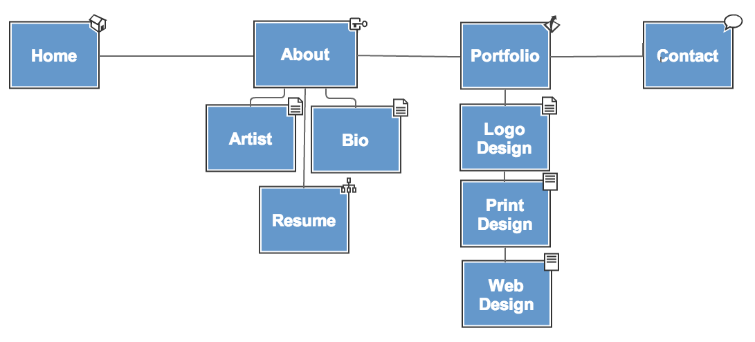
Site Map
You can create your sitemap using any number of different tools. Here are a couple of great tools used to create sitemaps. Great designer resources.
Wire frame: Where Content Elements Appear Within the Page
Wireframes are rough illustrations of page content and structure, which may also indicate how users will interact with the website. The first step is to great these diagram to establish page layout and then you will move to the visual design. Wireframes are useful for communicating early design ideas showing exactly what information, links, content, promotional space, and navigation will be on every page of the site. Wireframes may illustrate design priorities in cases where various types of information appear to be competing.
Since a site map does not indicate any hot links that may appear within a page, your wire frame will help you to determine how a user will navigate through your site beyond the main navigation. The purpose of a wire frame is to determine where each content piece will be displayed on the page, and which pieces will be displayed most prominently.
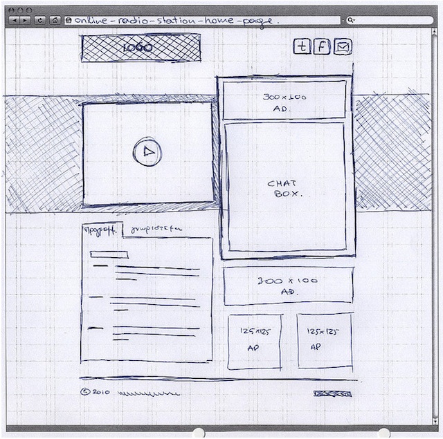
You do not need to worry about how each piece will look. The wire frame example below uses a tabbed navigation approach, however this visual is merely a placeholder and the designer may take a totally different aesthetic approach once the design phase begins.
Hand-drawn Wireframe
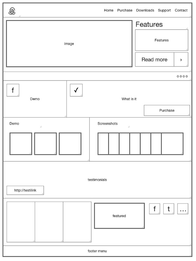
Grid Design of a Wireframe
The Web Site Design and Development Process
You’ve learned the basics of HTML/CSS, how to structure pages and how to create a navigational system for your site and now we’re in the midst of the design phase.
PHASE I: PLANNING
This is your most important stage in the web development process. Everything you map out in the planning stage will be the blue print for your entire project.
Requirements Analysis
- Website goals
- Target audience
- Defining your content
Site Map
- Structure your site
- Include page hierarchy
- Include links
Access to Servers
- Obtain and validate includes FTP host, username and password
- Control panel log-in information
RESOURCE LINKS FOR THIS PHASE:
- Jumpchart: Client/developer collaboration tool
- Dropbox: File-sharing and collaboration tool
- Mindmeister: Free online mind-mapping software
- Writing Bulletproof Web Design Contracts
PHASE I COMPLETED
PHASE II: DESIGN
In this stage you’ll move the information outlined in the planning stage closer to reality. Deliverables included are a documented site structure and a visual representation of your site.
Wireframe and Design Elements Planning
- Sketch out the basic navigation structure for your site
- Identify the number of pages
Mock-ups based on requirements analysis
- Using tools like Go Mockingbird, layout the main pages on your site
- Keep your design elements organized
Review Cycle
- Designing anything includes a series of iterations.
- Review the entire site layout and make changes PRIOR to coding the site
Styleframes
- Using the wireframes you created as a base, add style elements to your pages.
- Include the following:
- Colors: find the hexadecimal # for your colors
- Add your images to the layout
- Add your videos to the layout
- Add your icons and/or illustrations to the layout
- Add dummy text
Resource links for this phase:
- Printable Sketch Templates for Wireframing
- Go Mockingbird
- Color Scheme Designer
- Type Tester, font comparison
- iPlotz, online template and wireframing tool
- Stripe Generator
- Favicon Generator
- Icon Finder
- Stock Exchange, free stock photos
CREATING A DESIGN MOCKUP
Creating a style frame template
- Open the wireframes that you created for your site. You are going to use this as a guide for setting up your template. For every distinct interface that you have defined for your site, you will need to make a mockup for it. If your page layout doesn’t vary much from page to page, you may be able to use a single document and sets of layers to contain all the permutations.
- Create a new document in Photoshop or Illustrator. Go to File > New
- Set the following document settings:
- Size: 1280 × 800
- Resolution: 72 pixels/inch
- Mode: RGB
- Contents: Transparent
- Open your layers palette: Window > Layers.
- Create and name separate layers for each part of your design grid. Typical sections that your site may have are:
- Body (background color or pattern)
- Branding / Header (Logo and Site Title)
- Sidebar
- Global Navigation
- Content
- Section Heading
- Copy (sub-headings, paragraphs, lists, bullets and inline links)
- Footer (copyright and email link)
- Turn on your Rulers: Window > Show Rulers
- Use guides to define the sections of your design grid. Click on the Move Tool in the Tool palette and drag a horizontal and vertical guide from each ruler.
- Use the Photoshop or Illustrator tools to create your mockup. The mockup should show the client how the final interface will look. Specify logo, color scheme, fonts and positioning.
- Once you have finalized the your mockup you are ready to slice and optimize your images.
Here’s an example of a multi-page design comp:
Here’s what the actual site looks like when fully design an coded.
Good resource: 10 Tips for Creating Website Mockups
=====================================================================Final Photoshop Project Requirements
Documentation
• accurate sitemap
• revised wireframe
Content
•your homepage
•two addition pages
SITE MAP
A site map is a flow diagram of the pages contained in your website. This is the essential information architecture needed to build your website.
Tips for creating usable navigational systems:
Navigation should:
- Be easy to learn.
- Be consistent throughout the website.
- Provide feedback, such as the use of breadcrumbs to indicate how to navigate back to where the user started.
- Use the minimum number of clicks to arrive at the next destination.
- Use clear and intuitive labels, based on the user’s perspective and terminology.
- Support user tasks.
- Have each link be distinct from other links.
- Group navigation into logical units.
- Avoid making the user scroll to get to important navigation or submit buttons.
- Not disable the browser’s back button.
Create an outline of your website and include:
- Content Inventory: a hierarchical view of the site content, typically in a spreadsheet format, which briefly describes the content that should appear on each page and indicates where pages belong in terms of global and local navigation.
- Site Maps: visual diagrams that reflect site navigation and main content areas. They are usually constructed to look like flowcharts and show how users will navigate from one section to another. Other formats may also indicate the relationships between pages on the site.
Usability First is a great resource for developing your website. Go to this link and READ IT!
Here’s an example of what a sitemap could look like.
Site Map
You can create your sitemap using any number of different tools. Here are a couple of great tools used to create sitemaps. Great designer resources.
Wire frame: Where Content Elements Appear Within the Page
Wireframes are rough illustrations of page content and structure, which may also indicate how users will interact with the website. The first step is to great these diagram to establish page layout and then you will move to the visual design. Wireframes are useful for communicating early design ideas showing exactly what information, links, content, promotional space, and navigation will be on every page of the site. Wireframes may illustrate design priorities in cases where various types of information appear to be competing.
Since a site map does not indicate any hot links that may appear within a page, your wire frame will help you to determine how a user will navigate through your site beyond the main navigation. The purpose of a wire frame is to determine where each content piece will be displayed on the page, and which pieces will be displayed most prominently.
You do not need to worry about how each piece will look. The wire frame example below uses a tabbed navigation approach, however this visual is merely a placeholder and the designer may take a totally different aesthetic approach once the design phase begins.
=====================================================================
HOMEWORK | WEEK 9
- Create a new folder in your DropBox and call it Photoshop Project II Website Design.
- Complete DO NOW 1-4 as listed above
- Complete video tutorial
- Complete ONE of the six website design tutorials
- a preliminary wire frame for your home page
- two (2) interior pages ( try your about page, your portfolio page or your contact page)
- Your wire frame layouts will need to be intuitive to read and close to the scale that it will appear in the web browser. You will need to indicate if a part of the layout will fit above the “fold” (the portion of the screen that is visible to the user without requiring the user to scroll
- Design the page layout as 1280 x 800
Read: The following reference…
Barrett Communications – Wireframes: A Vital Step in Your Web Site Strategy
http://www.barrettcommunications.com/contentmgr/showdetails.php/id/378
Portfolio Tips for Design Students
Take a look at student work for inspiration
Week 7: Image Replacement and Box Model
IMAGE REPLACEMENT ROLLOVER FOR YOUR MAIN NAV
You can see a great example of image rollover on the Apple website.
Take a look at the image replacement rollover.
- Image replacement HTML
<div id=”nav”>
<ul id="navlinks">
   <li id="home"><a href="#">Home</a></li>
   <li id="navprojects"><a href="#">Projects</a></li>
   <li id="navclients"><a href="#">Clients</a></li>
   <li id="navevents"><a href="#">Events</a></li>
   <li id="navabout"><a href="#">About</a></li>
   <li id="navcontact"><a href="#">Contact</a></li>
 </ul>
</div>
- Image replacement CSS The key to this technique is to use a single image, containing all the navigation menu items and all of their states.
Then, set up a unordered list of links in your html page. This is a nice semantic way to represent navigation:
Make sure that you give the ul and each li unique ids.
Then, in your CSS, you can use link states (a, a:hover, a:active, a:visited) and background position to reveal the appropriate section of the background image.
LINKED STATES
In CSS: You can specify a visual change to happen based on the users interaction with the link:
a:link {color: #FF0000} = how the link text will appear
a:visited {color: #00FF00} = how the link will appear on a page when the user already has already viewed the page the link points to
a:hover {color: #FF00FF} = how the link will appear when the user holds their cursor on top of the link
a:active {color: #0000FF} = how the link will appear for the brief moment when the user clicks on it
NOTE: The link states should be specified in the order above or the changes to the links will not be visibly in all browsers or platforms
The Box Model
UNDERSTANDING THE BOX MODEL
In web designers we need to understand something called “the box model” — this mean we are using block-level elements with margins, padding, height, and width values to construct “boxes” in which to contain our material. It’s basically a series of boxes (and some even nested inside of others).
 Last week we talked about margin, padding and border. This week the focus will be more on position.
Download this example to play around with the CSS and HTML. After downloading the example, this is what you should see on your browser without making any changes.

Look at the HTML, the two boxes that fall beneath the heading are two divs that make a column Left and a column Right. In order for these divs not to implicit a linebreak, lets use the float property.
COMPLETE THE BOX MODEL LESSON ON CODE ACADEMY.
FLOAT
Look at the stylesheet. Scroll down to line 39 and you’ll see we’re going to apply a powerful property to have these two divs push left to the elements that proceeds it. Take out the comment symbols and save the document. Refresh your browser.


3. Floating
We can control our display values and our padding and margins, but how do we set the overall positioning of elements on a page? The answer: floats!
COMPLETE THE CODE ACADEMY TUTORIAL ON FLOATING.
CLEAR
Take a look at the HTML again, you’ll see that I have this empty div I classified as “makemeaboxagain”. This is a nice trick to apply in your document if there are some elements overlapping one another. This empty div guarantees that things will slide up against the edges of neighboring elements if a float has been applied. Look at the css.

COMPLETE THE Margins, Borders, and Padding LESSON ON CODE ACADEMY.
5. Review
Let’s go over what we’ve learned.
HOMEWORK | WEEK 7
- Complete the Code Academy 1-5 and review.
Complete the Box Model tutorial in the video below. Create a NEW style sheet specifically for the boxmodel.html page that you will create and call it: boxmodel.css.
Week 6 CSS Part 2
CSS Selectors
You’ve learned a bit about CSS—now it’s time to dive into the details of selectors, including multiple selectors, universal selectors, and class and ID selectors.
Complete Code Academy lesson:
1. A Greater Selection
You’re familiar with a number of CSS selectors already, such as div, span, h1 through h6, and p. Now we’re going to learn a few more!
Complete Code Academy
2. “C” is for “Cascading”
Now that you understand more about CSS selectors, we’ll cover its most powerful feature: cascading.
RULES AND SELECTORS
To style elements in a document, you apply rules to selectors. A “selector” is a way of referring to some specific element or group of elements on a page. If you want to apply a style to all paragraphs, then the <p> (paragraph) tag is our “selector” – it’s what we’re “selecting” to style. Selectors can either be standard HTML tags, or custom elements you define.
A “rule” is a set of properties that get applied to the selected element or elements. A rule can be as simple as a single line declaring the background color of the element, or a complex grouping of properties that work together to achieve an effect.
Let’s walk through styling a single paragraph. First, attach a style to an element on the page, and create rules as name:value pairs, separated by semi-colons. (You’re writing this all in your HTML page)

This single paragraph, the paragraph that you applied the color “red” to, will look different from every other paragraph on the page. The text will be red.
Lorem ipsum dolor sit amet, consectetur adipisicing elit, sed do eiusmod tempor incididunt ut labore et dolore magna aliqua. Ut enim ad minim veniam, quis nostrud exercitation ullamco laboris nisi ut aliquip ex ea commodo …
Now, delete the “<p style=”color:red;> from your HTML page. Go into Text Wrangler and create a new page and call it style.css. This will be your EXTERNAL stylesheet. See the image below.

In the new style.css document you’ve created, write in the following:
p {
color:red; }Note: You must put this link inside the header tags. <link rel=”stylesheet” type=”text/css” href=”style.css” /> You can add as many rules as you want. See a few more below:
p {
color:black; font-size:12px; font-family:Verdana; }NO style tags are to be used inside your HTML document. Everything will be placed in an external stylesheet called style.css.
CSS Basics – HTML/CSS
Complete Code Academy
3. Class and ID Selectors
It’s true that all HTML elements can be CSS selectors, CSS selectors can include more than HTML elements! It’s time to learn about CSS classes and IDs.
CUSTOM SELECTORS
In the example above, every <p> tag will have ALL the attributes you list. This is a page-wide rule that is applied to all paragraphs on the page. That’s fine in some circumstances but what if you want to apply a specific attribute to a specific paragraph? CSS uses the “class” and “id” constructs to make this very eacy. By attaching a “class” name to an HTML element, and writing a corresponding rule for that class, you can get as specific as you like. Go back to the style rules above and modify them to look like this:
p {
color:red;
font-size:10px;
font-family:Arial;
}
.mango {
color:blue;
background-color:gold;
border:3px solid black;
padding 15px;
}
Now, modify the opening <p> tag of your paragraphs to look like this:
| 1 | <p class="mango">Lorem ipsum ... </p> |
That specific single paragraph on your page will have the additional stylistic information taken from the style.css doc from .alert. That specific paragraph will now have the font color: red, font-size:10px, font-family:arial and everything listed under .alert. If you add <p class=”alert”> to another <p> tag on your page, that <p> tag will also have the same attributes. If you want another <p> on the page to have different and specifics attributes, simply name it something different. Example: <p class=”monkey”> and write the specific .monkey attributes in your style.css page.
CLASS VS. ID
There are two constructs for custom selectors — “class” and “id.” Class can be applied as many times as you like on a page. IDs work almost the same way, but apply to just one element on a page. When creating rules for IDs, simply prepend the selector name with “#” rather than “.” Example:
#footer {
color:#ff0000;
background-color:red;
border:2px solid black;
padding:20px;
}
Since you will probably only ever have one footer on a page, it makes sense to use this as an ID rather than as a class. You would invoke this ruleset in your document like this:
| 1 |
<p id="footer">Lorem ipsum dolor sit ... irure dolor in reprehenderit in </p> |
Complete Code Academy
4. Pseudo-Class Selectors
You know how to style a link with CSS. But how would you use CSS to make a link one color if it hasn’t been clicked, and a different color once it has?
REFINING SELECTORS
Above we created rules that apply either to a single HTML tag, or to anything that matches a custom selector name. But we have a lot more control than that. You can broaden or narrow the “scope” of elements your rulesets apply to.
You can easily apply a <p> style to both a paragraph andlists or a block quote or just about anything else. You could just duplicate the rule, but it would give you more work because any time you modified one, you’d have to modify all the rest as well. CSS easily solves this problem by allowing you list a set of selectors for a given rule. See below:
p, ol, ul, dd, blockquote {
color:#00ff00;
font-size:14px;
font-family:Verdana;
}
Now the rules in the set will apply equally to paragraphs, ordered, unordered and definition lists, and to blockquotes. If you want to set basic rules that will apply to your entire document, there’s an easier way — just use the <body> tag as your selector:
body {
color:#00ff00;
font-size:14px;
font-family:Verdana;
}
Since all visible elements in a document (elements that show up on your website) fall inside the opening and closing <body> tags, the rules above will apply to everything on the page. CSS favors the specific over the general so you can easily override any rule on a per-selector basis. For example:
body {
color:#000000;
font-size:14px;
font-family:Verdana;
}
blockquote {
color:#ffffff;}
Even though you’ve defined a color for the entire document within you <body> tage, and your block quotes fall inside that document, blockquotes will be rendered with a white font (#ffffff stands for white). The cascade says that even though everything on the page is black by default (you listed that in the <body> tag), blockquotes are treated like an exception.
Narrowing the Scope of Rulesets
We can also create the opposite situation. Above, I showed you the class .mango, which applied to anything on the page with class="mango". What if you want to be more specific than that or if you only want those rules to apply to paragraphs in that specific class, but not to blockquotes in that class. This is done like this:
p.mango {
color:darkred;
background-color:blue;
border:2px solid black;
padding:10px;
}
The rule above would not be invoked for standard paragraphs, nor would it be invoked for blockquotes with a class of “mango.” It would only be invoked for paragraphs with a class of “mango.” This “narrowing” approach can be used for IDs as well as classes:
p#mango {
color:darkred;
background-color:blue;
border:2px solid black;
padding:10px;
}
The rule above would not be invoked for standard paragraphs, nor would it be invoked for blockquotes with a class of “mango.” It would only be invoked for paragraphs with a class of “mango”. This “narrowing” approach can be used for IDs as well as classes:
p#mango{
color:darkred;
background-color:bisque;
border:2px solid gray;
padding:10px;
}
FONTS AND TEXT
You can set the font face (font-family), the font size, font style (such as italic) and the font weight (such as bold):
p {
font-family:”Arial”,Verdana;Georgia,Serif;
font-size:10pt;
font-weight:bold;
font-style:underline;
}
Font sizes can be set in pixels, points, ems, or relative values.
From within CSS you can control how wide your letters and lines are spaced, set your text color, align text right, left or center, and even change the case of text.
Setting text color and letter spacing:
Letter spacing can be set in points, pixels, or ems. “Em” is a typesetter’s term, referring to the width of one character. It is recommend to use ems when setting text sizes and widths, because it flexes automatically with the user’s current screen resolution and magnification.
Line spacing is not set in ems – it’s a simple decimal value representing a factor of the current line height. In the example below, “1.8″ means “spacing between lines should be 1.8 times whatever the current height of a line of text is.”
p {
color:#166A3F;
font-weight:bold;
letter-spacing: 0.3em;
line-height: 1.8;
}
If you wanted to make the text uppercase, just add the following line : text-transform: uppercase; If you wanted to change the text alignment, just add the following line: text-align: center|left|right; (You would need to choose either center, left or right). You could also add: text-align:justify; if you wanted the text to justify into a block.
BORDERS
You can put a border around almost anything on your page including a single character, an image or a section of a page. Borders can be of any thickness, any color, and can be solid, dotted, or dashed. If you use border: by itself, the border will go around all four sides of the element. Or you can use border-top:, border-left: and so on to control each side of the border independently. You can can consolidate all of the attributes of the border into a single command by separating the attributes with spaces.
Example:
p {
border:1px solid #4c97ff;
}
By not specifying a side, you get the same 1px consistent border on all four sides of an element. If you want to control each specific side of a border, use: (change the colors to what ever you like)
p {
border-top:3px solid #595128;
border-right:5px solid #3d3600;
border-left:2px dotted #5bbe00;
border-bottom:5px dashed #005062;
}
Using four different colors on a border would be pretty ugly so try his. A 1px border around a paragraph would look like this:

BACKGROUNDS
You can set the background of any element with your choice of either a solid color or a tiled (repeating) image.
Example:
p {
background-color:#00ff00;
}
If you want to use a tiled image as a background, just specify its relative or absolute URL:
p {
background-image: url(‘http://a3.twimg.com/profile_images/454374541/iTunesU_Button.jpg’)
}

By default, a background image will tile repeatedly in all directions, to fill up the space it’s assigned to. You can tell your background image to only repeat along the x or y axis. In the next example, we use both a background color and a background image. We tell the background image to only repeat vertically. To prevent the text from sitting on top of the tiled image, we add 120px of left padding.
p {
background-image: url(‘http://a3.twimg.com/profile_images/454374541/iTunesU_Button.jpg’);
background-repeat: repeat-y;
background-color:#D33333;
padding:10px;
padding-left:120px;
border:1px solid #899999;
}
;)

MARGINS AND PADDING
Margins refer to the area around, or outside of an element. Padding, refers to the area between the edges of a box and what lives inside that box. An easy way to remember which is which is to think of mailing a breakable object – you fill the empty space in the box with foam peanuts to protect the item. Those foam peanuts are your padding. The margin would then be the space between your box and the next box in the truck. Just remember: Padding is inside the box, margins are outside the box.
In CSS, you’ll use padding to give an element some breathing room within the space it’s in, as we did with the last example in the Backgrounds section. You typically use margins to cause a box or element to be offset from adjacent elements. The syntax for working with padding and margins is very similar.
Padding and margins may just seem decorative right now, but they’ll become critical when we start getting into CSS page layout, so make sure you understand them.
Example:
p {
padding:25px;
border:4px solid blue;
}
Would give you below:
Just like borders, padding can be controlled for the whole box, as above, or per-side:
p {
padding-top:0px;
padding-right:25px;
padding-bottom:45px;
padding-left:15px;
border:4px solid blue;
}
When setting padding values separately for different sides of a box, you can use this shorthand, which achieves exactly the same result as the previous example:
p {
padding:0px 25px 45px 15px;
border:4px solid blue;
}
MARGINS
To illustrate how margins work, I’ll show you how one element (box) relates to another. For this example, we’ll be putting a sample paragraph inside of an element called a “div”. A div is an arbitrary box used to contain other things. I’ll put a border on the div so you can see it, then put a paragraph with its own border inside that div, so you can see what the margin attributes do to it.
div {
padding:0px;
margin:0px;
border:1px solid blue;
background-color:#AFEEBD;
}
p {
padding:10px;
margin:10px;
border:1px solid blue;
background-color:#ACCFDB;
}
The blue space above represents the paragraph, while the green space represents the margin between that paragraph and it’s containing box. As with padding, we can control margin depths per-side, rather than globally.
LISTS AND CSS
An ordered or unordered list can be much more than a simple set of bullet points – in CSS, lists are often used to create navigation elements such as horizontal or vertical menus. Let’s start with options for simple lists.
For unordered lists, you can select whether the bullet style should be circular, square, or none:
ul {
list-style-type: square;
}
apple
Is a
List
Try changing “square” to “circle” or “disc” for other effects. You can also use an image in place of your bullets by specifying its URL:
ul {
list-style-image: url(http://www.w3schools.com/css/arrow.gif);
}
This
Is a
List
Ordered lists can have any combination of Roman numerals, decimal, alphabetic characters and more. A nice trick is to nest lists within lists, then use the CSS nested selector syntax we learned earlier to style different levels of your list differently, like this:
;)
ol {
list-style-type: upper-roman;
}
ol ol {
list-style-type: decimal;
}
ol ol ol {
list-style-type: lower-alpha;
}
Person
Place
Region
Country
United States
Canada
Mexico
State
Thing
In the example here, ordered lists “ol” are told to use “upper-roman” as the list-style-type, unless it’s an ordered list inside of an ordered list, in which case the list-style-type is “decimal”… unless it’s a triply nested ordered list, in which case the list-style-type is “lower-alpha.” This technique is the key to building CSS based flyout navigation menus.
LISTS AS MENUS IN CSS
By default, list items are “block-level elements,” which means each one gets a line break above and below itself. To make a list appear horizontally, we need to override the default block behavior and use CSS to tell list items that they’re “inline” elements instead. In this example, we’ve also added background-color and padding to our list items, to make them appear like real menu items. Here is the simple HTML and CSS to create a basic list menu.
li {
display: inline;
list-style-type: none;
background-color:#425899;
color:white;
padding:5px;
}
<ul>
<li>Item one</li>
<li>Item two</li>
<li>Item three</li>
<li>Item four</li>
<li>Item five</li>
</ul>
Which seen by the browser it looks like this:
To make the experience more intuitive, we want to add some rollover behavior, so that the list items change color when the mouse rolls over them. To accomplish this, we’ll first make our list items into links (in the HTML). Then we’ll again use the CSS nested selector syntax to detect a linked item inside of a list item. Finally, we’ll use the anchor tag’s :hover pseudo-property to change appearance when a list item is in a certain state – namely, when the mouse is hovering over it.
li {
display: inline;
list-style-type: none;
}
li a {
background-color: #60996C;
color:white;
padding:5px;
text-decoration:none;
}
li a:hover {
/* This rule is only in effect when mouse is hovering */
background-color: #567499;
}
<ul>
<li><a href=”#”>Item one</a></li>
<li><a href=”#”>Item two</a></li>
<li><a href=”#”>Item three</a></li>
<li><a href=”#”>Item four</a></li>
<li><a href=”#”>Item five</a></li>
</ul>
See below. Roll mouse over list items to see the hover state in effect.
Complete Code Academy
5. Review
Let’s go over what you’ve learned in this lesson.
HOMEWORK | WEEK 6
- Create your own UL list – make it inline – FOR YOUR MAIN NAV and include rollover states (hover) – put this as the main menu on every page on y our website.
- Post the new work and link it to your homework page.
- Add a border, background-color and a background image to any HTML page you’ve been working on.
- On your HOMEWORK.HTML PAGE create sub headings:
Week 1
Week 2
Week 3
Week 4
Week 5
And under each heading, list the homework and give me a link to where the homework is located.
The following homework should be completed:
- Register your blog
- Delicious
- Create resume and artist statement word documents
- Gravatar
- Add Google Chrome web developer
- Create Resume, Index, Contact and Artist Statement pages
- Mark up your resume
- Put all homework links on homework.html page
- Longest page, add back to top markup
- Make and unordered list
- Create an external CSS for all pages
- Add div’s to all your pages
- Use styles including font, color size
- Make an image gallery with 6 images including thumbnail and full sizes
- Create css stylesheet that includes different backgrounds, headings, links and list styles for each of the three divs
- Create a horizontal menu with hover state
- Completed Code Academy Web Fundamentals classes:
Introduction to HTML
HTML Structure: Using Lists
HTML Structure: Tables, Divs, and Spans
Introduction to CSS
CSS Classes and IDs
- Complete all exercises on Code Academy in section:
CSS Classes and IDs (including sections 1-5)
. Take a screen shot once you’ve completed it and post on your blog.
Week 4 – CSS pt. 2
HOMEWORK | WEEK 3 | Review
- If you have any outstanding validation errors in your bio and resume HTML, resolve them. Also, if you receive any comments from me today in class, or via email in the following week, incorporate them into your pages.
- Using all the properties we have covered today, create a single, external stylesheet and apply it to both your bio and your resume pages.
- Post the new work and link it to your homework page.
- Go back into your index.html, artist.html, resume.html and contact.html pages and add div’s.
- Create a style.css page in Text Wrangler and link it to your index.html, artist.html, resume.html and contact.html pages. Add the div names in your css page and STYLE them including font, color, size and any other attributes you want to use.
- Take any 12 images. They can be photos, illustrations, your artwork, anything you have. If you do not have anything you can pull images from Google images or create different colored boxes and use those as images. Create two different sizes of these images, one thumbnail image and one full size image. The full size image should not exceed 800×600 pixels. Use the “Save for Web” process to optimize the images, saving them in the file format most appropriate for each image. Save these images to the “images” folder you created in week two.
- Create HTML / CSS using the thumbnail size of the images that duplicates the functionality of the thumbnail gallery that we went over in class today. Take the thumbnail gallery one step further – link each thumbnail to its full sized image. Post the files and images to your server and put the link to the gallery on your blog.
- Embed a video on one of your pages.
- Add a background image.
- Make one of your images link to another website.
- Add at least one image that has rounded corners.
- Add ALT, HEIGHT & WIDTH properties to all your images.
- Add a border to one of your pages.
- Complete 1-5 on CSS in Code Academy
IMAGE REPLACEMENT ROLLOVER FOR YOUR MAIN NAV
You can see a great example of image rollover on the Apple website.
Take a look at the image replacement rollover.
<div id=”nav”>
<ul id="navlinks">
   <li id="home"><a href="#">Home</a></li>
   <li id="navprojects"><a href="#">Projects</a></li>
   <li id="navclients"><a href="#">Clients</a></li>
   <li id="navevents"><a href="#">Events</a></li>
   <li id="navabout"><a href="#">About</a></li>
   <li id="navcontact"><a href="#">Contact</a></li>
 </ul>
</div>
- Image replacement CSS The key to this technique is to use a single image, containing all the navigation menu items and all of their states.
Then, set up a unordered list of links in your html page. This is a nice semantic way to represent navigation:
Make sure that you give the ul and each li unique ids.
Then, in your CSS, you can use link states (a, a:hover, a:active, a:visited) and background position to reveal the appropriate section of the background image.
The Box Model
An explanation of what the box model is and how it is treated by different user agents.
An explanation of what the box model is and how it is treated by different user agents.
The term “box model” is often used by people when talking about CSS-based layouts and design. Any HTML element can be considered a box, and so the box model applies to all HTML elements.
The box model is the specification that defines how a box and its attributes relate to each other. In its simplest form, the box model tells browsers that a box defined as having width 100 pixels and height 50 pixels should be drawn 100 pixels wide and 50 pixels tall.
There is more you can add to a box, though, like padding, margins, borders, etc. This image should help explain what I’m about to run through:

Let’s go to this website to check out the full tutorial on box models.

RULES AND SELECTORS
To style elements in a document, you apply rules to selectors. A “selector” is a way of referring to some specific element or group of elements on a page. If you want to apply a style to all paragraphs, then the <p> (paragraph) tag is our “selector” – it’s what we’re “selecting” to style. Selectors can either be standard HTML tags, or custom elements you define.
A “rule” is a set of properties that get applied to the selected element or elements. A rule can be as simple as a single line declaring the background color of the element, or a complex grouping of properties that work together to achieve an effect.
Let’s walk through styling a single paragraph. First, attach a style to an element on the page, and create rules as name:value pairs, separated by semi-colons. (You’re writing this all in your HTML page)
This single paragraph, the paragraph that you applied the color “red” to, will look different from every other paragraph on the page. The text will be red.
Lorem ipsum dolor sit amet, consectetur adipisicing elit, sed do eiusmod tempor incididunt ut labore et dolore magna aliqua. Ut enim ad minim veniam, quis nostrud exercitation ullamco laboris nisi ut aliquip ex ea commodo …
Now, delete the “<p style=”color:red;> from your HTML page. Go into Text Wrangler and create a new page and call it style.css. This will be your EXTERNAL stylesheet. See the image below.
In the new style.css document you’ve created, write in the following:
p {
color:red; }Note: You must put this link inside the header tags. <link rel=”stylesheet” type=”text/css” href=”style.css” /> You can add as many rules as you want. See a few more below:
p {
color:black; font-size:12px; font-family:Verdana; }NO style tags are to be used inside your HTML document. Everything will be placed in an external stylesheet called style.css.
CSS Basics – HTML/CSS
CUSTOM SELECTORS
In the example above, every <p> tag will have ALL the attributes you list. This is a page-wide rule that is applied to all paragraphs on the page. That’s fine in some circumstances but what if you want to apply a specific attribute to a specific paragraph? CSS uses the “class” and “id” constructs to make this very eacy. By attaching a “class” name to an HTML element, and writing a corresponding rule for that class, you can get as specific as you like. Go back to the style rules above and modify them to look like this:
p {
color:red;
font-size:10px;
font-family:Arial;
}
.mango {
color:blue;
background-color:gold;
border:3px solid black;
padding 15px;
}
Now, modify the opening <p> tag of your paragraphs to look like this:
|
1
|
<p class="mango">Lorem ipsum ... </p> |
That specific single paragraph on your page will have the additional stylistic information taken from the style.css doc from .alert. That specific paragraph will now have the font color: red, font-size:10px, font-family:arial and everything listed under .alert. If you add <p class=”alert”> to another <p> tag on your page, that <p> tag will also have the same attributes. If you want another <p> on the page to have different and specifics attributes, simply name it something different. Example: <p class=”monkey”> and write the specific .monkey attributes in your style.css page.
CLASS VS. ID
There are two constructs for custom selectors — “class” and “id.” Class can be applied as many times as you like on a page. IDs work almost the same way, but apply to just one element on a page. When creating rules for IDs, simply prepend the selector name with “#” rather than “.” Example:
#footer {
color:#ff0000;
background-color:red;
border:2px solid black;
padding:20px;
}
Since you will probably only ever have one footer on a page, it makes sense to use this as an ID rather than as a class. You would invoke this ruleset in your document like this:
|
1
|
<p id="footer">Lorem ipsum dolor sit ... irure dolor in reprehenderit in </p> |
REFINING SELECTORS
Above we created rules that apply either to a single HTML tag, or to anything that matches a custom selector name. But we have a lot more control than that. You can broaden or narrow the “scope” of elements your rulesets apply to.
You can easily apply a <p> style to both a paragraph andlists or a block quote or just about anything else. You could just duplicate the rule, but it would give you more work because any time you modified one, you’d have to modify all the rest as well. CSS easily solves this problem by allowing you list a set of selectors for a given rule. See below:
p, ol, ul, dd, blockquote {
color:#00ff00;
font-size:14px;
font-family:Verdana;
}
Now the rules in the set will apply equally to paragraphs, ordered, unordered and definition lists, and to blockquotes. If you want to set basic rules that will apply to your entire document, there’s an easier way — just use the <body> tag as your selector:
body {
color:#00ff00;
font-size:14px;
font-family:Verdana;
}
Since all visible elements in a document (elements that show up on your website) fall inside the opening and closing <body> tags, the rules above will apply to everything on the page. CSS favors the specific over the general so you can easily override any rule on a per-selector basis. For example:
body {
color:#000000;
font-size:14px;
font-family:Verdana;
}
blockquote {
color:#ffffff;}
Even though you’ve defined a color for the entire document within you <body> tage, and your block quotes fall inside that document, blockquotes will be rendered with a white font (#ffffff stands for white). The cascade says that even though everything on the page is black by default (you listed that in the <body> tag), blockquotes are treated like an exception.
Narrowing the Scope of Rulesets
We can also create the opposite situation. Above, I showed you the class .mango, which applied to anything on the page with class="mango". What if you want to be more specific than that or if you only want those rules to apply to paragraphs in that specific class, but not to blockquotes in that class. This is done like this:
p.mango {
color:darkred;
background-color:blue;
border:2px solid black;
padding:10px;
}
The rule above would not be invoked for standard paragraphs, nor would it be invoked for blockquotes with a class of “mango.” It would only be invoked for paragraphs with a class of “mango.” This “narrowing” approach can be used for IDs as well as classes:
p#mango {
color:darkred;
background-color:blue;
border:2px solid black;
padding:10px;
}
The rule above would not be invoked for standard paragraphs, nor would it be invoked for blockquotes with a class of “mango.” It would only be invoked for paragraphs with a class of “mango”. This “narrowing” approach can be used for IDs as well as classes:
p#mango{
color:darkred;
background-color:bisque;
border:2px solid gray;
padding:10px;
}
FONTS AND TEXT
You can set the font face (font-family), the font size, font style (such as italic) and the font weight (such as bold):
p {
font-family:”Arial”,Verdana;Georgia,Serif;
font-size:10pt;
font-weight:bold;
font-style:underline;
}
Font sizes can be set in pixels, points, ems, or relative values.
From within CSS you can control how wide your letters and lines are spaced, set your text color, align text right, left or center, and even change the case of text.
Setting text color and letter spacing:
Letter spacing can be set in points, pixels, or ems. “Em” is a typesetter’s term, referring to the width of one character. It is recommend to use ems when setting text sizes and widths, because it flexes automatically with the user’s current screen resolution and magnification.
Line spacing is not set in ems – it’s a simple decimal value representing a factor of the current line height. In the example below, “1.8″ means “spacing between lines should be 1.8 times whatever the current height of a line of text is.”
p {
color:#166A3F;
font-weight:bold;
letter-spacing: 0.3em;
line-height: 1.8;
}
If you wanted to make the text uppercase, just add the following line : text-transform: uppercase; If you wanted to change the text alignment, just add the following line: text-align: center|left|right; (You would need to choose either center, left or right). You could also add: text-align:justify; if you wanted the text to justify into a block.
BORDERS
You can put a border around almost anything on your page including a single character, an image or a section of a page. Borders can be of any thickness, any color, and can be solid, dotted, or dashed. If you use border: by itself, the border will go around all four sides of the element. Or you can use border-top:, border-left: and so on to control each side of the border independently. You can can consolidate all of the attributes of the border into a single command by separating the attributes with spaces.
Example:
p {
border:1px solid #4c97ff;
}
By not specifying a side, you get the same 1px consistent border on all four sides of an element. If you want to control each specific side of a border, use: (change the colors to what ever you like)
p {
border-top:3px solid #595128;
border-right:5px solid #3d3600;
border-left:2px dotted #5bbe00;
border-bottom:5px dashed #005062;
}
Using four different colors on a border would be pretty ugly so try his. A 1px border around a paragraph would look like this:
BACKGROUNDS
You can set the background of any element with your choice of either a solid color or a tiled (repeating) image.
Example:
p {
background-color:#00ff00;
}
If you want to use a tiled image as a background, just specify its relative or absolute URL:
p {
background-image: url(‘http://a3.twimg.com/profile_images/454374541/iTunesU_Button.jpg’)
}
By default, a background image will tile repeatedly in all directions, to fill up the space it’s assigned to. You can tell your background image to only repeat along the x or y axis. In the next example, we use both a background color and a background image. We tell the background image to only repeat vertically. To prevent the text from sitting on top of the tiled image, we add 120px of left padding.
p {
background-image: url(‘http://a3.twimg.com/profile_images/454374541/iTunesU_Button.jpg’);
background-repeat: repeat-y;
background-color:#D33333;
padding:10px;
padding-left:120px;
border:1px solid #899999;
}
MARGINS AND PADDING
Margins refer to the area around, or outside of an element. Padding, refers to the area between the edges of a box and what lives inside that box. An easy way to remember which is which is to think of mailing a breakable object – you fill the empty space in the box with foam peanuts to protect the item. Those foam peanuts are your padding. The margin would then be the space between your box and the next box in the truck. Just remember: Padding is inside the box, margins are outside the box.
In CSS, you’ll use padding to give an element some breathing room within the space it’s in, as we did with the last example in the Backgrounds section. You typically use margins to cause a box or element to be offset from adjacent elements. The syntax for working with padding and margins is very similar.
Padding and margins may just seem decorative right now, but they’ll become critical when we start getting into CSS page layout, so make sure you understand them.
Example:
p {
padding:25px;
border:4px solid blue;
}
Would give you below:
Just like borders, padding can be controlled for the whole box, as above, or per-side:
p {
padding-top:0px;
padding-right:25px;
padding-bottom:45px;
padding-left:15px;
border:4px solid blue;
}
When setting padding values separately for different sides of a box, you can use this shorthand, which achieves exactly the same result as the previous example:
p {
padding:0px 25px 45px 15px;
border:4px solid blue;
}
MARGINS
To illustrate how margins work, I’ll show you how one element (box) relates to another. For this example, we’ll be putting a sample paragraph inside of an element called a “div”. A div is an arbitrary box used to contain other things. I’ll put a border on the div so you can see it, then put a paragraph with its own border inside that div, so you can see what the margin attributes do to it.
div {
padding:0px;
margin:0px;
border:1px solid blue;
background-color:#AFEEBD;
}
p {
padding:10px;
margin:10px;
border:1px solid blue;
background-color:#ACCFDB;
}
The blue space above represents the paragraph, while the green space represents the margin between that paragraph and it’s containing box. As with padding, we can control margin depths per-side, rather than globally.
LISTS AND CSS
An ordered or unordered list can be much more than a simple set of bullet points – in CSS, lists are often used to create navigation elements such as horizontal or vertical menus. Let’s start with options for simple lists.
For unordered lists, you can select whether the bullet style should be circular, square, or none:
ul {
list-style-type: square;
}
apple
Is a
List
Try changing “square” to “circle” or “disc” for other effects. You can also use an image in place of your bullets by specifying its URL:
ul {
list-style-image: url(http://www.w3schools.com/css/arrow.gif);
}
This
Is a
List
Ordered lists can have any combination of Roman numerals, decimal, alphabetic characters and more. A nice trick is to nest lists within lists, then use the CSS nested selector syntax we learned earlier to style different levels of your list differently, like this:
ol {
list-style-type: upper-roman;
}
ol ol {
list-style-type: decimal;
}
ol ol ol {
list-style-type: lower-alpha;
}
Person
Place
Region
Country
United States
Canada
Mexico
State
Thing
In the example here, ordered lists “ol” are told to use “upper-roman” as the list-style-type, unless it’s an ordered list inside of an ordered list, in which case the list-style-type is “decimal”… unless it’s a triply nested ordered list, in which case the list-style-type is “lower-alpha.” This technique is the key to building CSS based flyout navigation menus.
LISTS AS MENUS IN CSS
By default, list items are “block-level elements,” which means each one gets a line break above and below itself. To make a list appear horizontally, we need to override the default block behavior and use CSS to tell list items that they’re “inline” elements instead. In this example, we’ve also added background-color and padding to our list items, to make them appear like real menu items. Here is the simple HTML and CSS to create a basic list menu.
li {
display: inline;
list-style-type: none;
background-color:#425899;
color:white;
padding:5px;
}
<ul>
<li>Item one</li>
<li>Item two</li>
<li>Item three</li>
<li>Item four</li>
<li>Item five</li>
</ul>
Which seen by the browser it looks like this:
To make the experience more intuitive, we want to add some rollover behavior, so that the list items change color when the mouse rolls over them. To accomplish this, we’ll first make our list items into links (in the HTML). Then we’ll again use the CSS nested selector syntax to detect a linked item inside of a list item. Finally, we’ll use the anchor tag’s :hover pseudo-property to change appearance when a list item is in a certain state – namely, when the mouse is hovering over it.
li {
display: inline;
list-style-type: none;
}
li a {
background-color: #60996C;
color:white;
padding:5px;
text-decoration:none;
}
li a:hover {
/* This rule is only in effect when mouse is hovering */
background-color: #567499;
}
<ul>
<li><a href=”#”>Item one</a></li>
<li><a href=”#”>Item two</a></li>
<li><a href=”#”>Item three</a></li>
<li><a href=”#”>Item four</a></li>
<li><a href=”#”>Item five</a></li>
</ul>
See below. Roll mouse over list items to see the hover state in effect.
HOMEWORK | WEEK 4
If you receive any comments from me today in class, or via email in the following week, incorporate them into your pages.
Watch the “Box model with css” video on this page again. Create a new page and call it boxmodel.html. Make sure you update you navigation list in your other pages to add this new page. In your boxmodel.html page, create a page with the black, green red and blue boxes that looks exactly like what is in the video. Make a SPECIFIC css document for this boxmodel and call it boxmodel.css.
Post the new work and link it to your homework page.
Create your nav document in Photoshop and using the code I’ve supplied above, create a new nav for your HTML pages.