IMAGE REPLACEMENT ROLLOVER FOR YOUR MAIN NAV
You can see a great example of image rollover on the Apple website.
Take a look at the image replacement rollover.
- Image replacement HTML
<ul id="navlinks">
   <li id="home"><a href="#">Home</a></li>
   <li id="navprojects"><a href="#">Projects</a></li>
   <li id="navclients"><a href="#">Clients</a></li>
   <li id="navevents"><a href="#">Events</a></li>
   <li id="navabout"><a href="#">About</a></li>
   <li id="navcontact"><a href="#">Contact</a></li>
 </ul>
</div>
- Image replacement CSS The key to this technique is to use a single image, containing all the navigation menu items and all of their states.
Then, set up a unordered list of links in your html page. This is a nice semantic way to represent navigation:
Make sure that you give the ul and each li unique ids.
Then, in your CSS, you can use link states (a, a:hover, a:active, a:visited) and background position to reveal the appropriate section of the background image.

LINKED STATES
In CSS: You can specify a visual change to happen based on the users interaction with the link:
a:link {color: #FF0000} = how the link text will appear
a:visited {color: #00FF00} = how the link will appear on a page when the user already has already viewed the page the link points to
a:hover {color: #FF00FF} = how the link will appear when the user holds their cursor on top of the link
a:active {color: #0000FF} = how the link will appear for the brief moment when the user clicks on it
NOTE: The link states should be specified in the order above or the changes to the links will not be visibly in all browsers or platforms
The Box Model
UNDERSTANDING THE BOX MODEL
In web designers we need to understand something called “the box model” — this mean we are using block-level elements with margins, padding, height, and width values to construct “boxes” in which to contain our material. It’s basically a series of boxes (and some even nested inside of others).
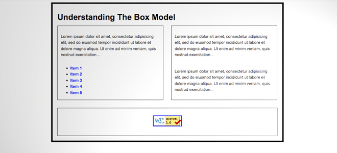 Last week we talked about margin, padding and border. This week the focus will be more on position.
Download this example to play around with the CSS and HTML. After downloading the example, this is what you should see on your browser without making any changes.
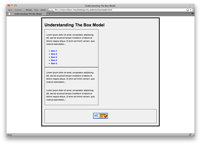
Look at the HTML, the two boxes that fall beneath the heading are two divs that make a column Left and a column Right. In order for these divs not to implicit a linebreak, lets use the float property.
COMPLETE THE BOX MODEL LESSON ON CODE ACADEMY.
FLOAT
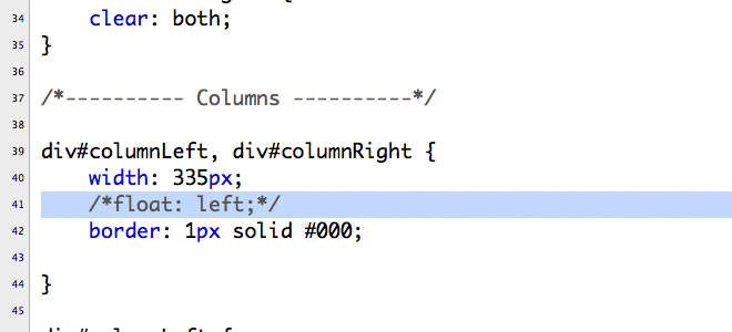
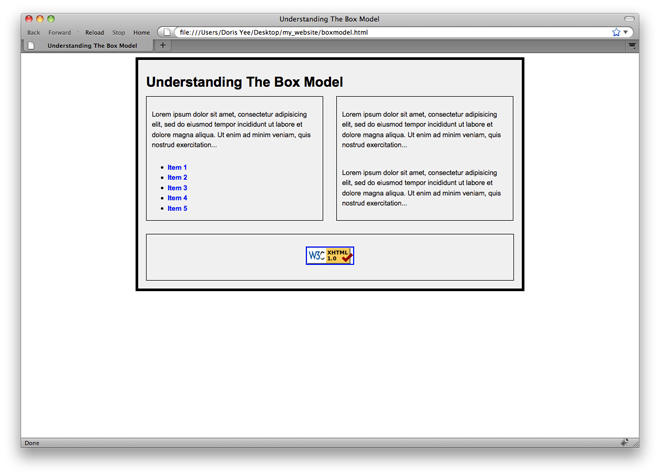
Look at the stylesheet. Scroll down to line 39 and you’ll see we’re going to apply a powerful property to have these two divs push left to the elements that proceeds it. Take out the comment symbols and save the document. Refresh your browser.
3. Floating
We can control our display values and our padding and margins, but how do we set the overall positioning of elements on a page? The answer: floats!
COMPLETE THE CODE ACADEMY TUTORIAL ON FLOATING.
CLEAR
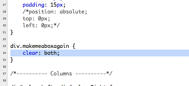
Take a look at the HTML again, you’ll see that I have this empty div I classified as “makemeaboxagain”. This is a nice trick to apply in your document if there are some elements overlapping one another. This empty div guarantees that things will slide up against the edges of neighboring elements if a float has been applied. Look at the css.
COMPLETE THE Margins, Borders, and Padding LESSON ON CODE ACADEMY.
5. Review
Let’s go over what we’ve learned.
HOMEWORK | WEEK 7
- Complete the Code Academy 1-5 and review.
Complete the Box Model tutorial in the video below. Create a NEW style sheet specifically for the boxmodel.html page that you will create and call it: boxmodel.css.
Good morning!
Here are my links:
http://katthompson.net
http://katherinathompson.wordpress.com
travisbennettportfolio.com/homework.html
Present.
http://www.somethingtoosee.net
http://julliehusclarkeclayton.wordpress.com/
I am here Professor.
I logged in earlier.
http://www.chadburnham.com/index.html
http://adewoleojo.com 1